Plot Gallery - Mo
Daniel Fitze 
Gerda Wyssen
# Beginnen Sie hier mit Ihrem Code:
#d <- as.data.frame()
# Plot erstellen
# Rohdaten plotten
plot_rohdaten <- ggplot(d, aes(x = trial, y = rt, color = congruent)) +
geom_point() +
labs(title = "Stroop Aufgabe",
subtitle = "Vergleich der Reaktionszeiten nach Bedingung",
x = "Versuch",
y = "Reaktionszeit (s)",
color = "Kongruenz",
caption = "dataset_stroop_clean") +
theme_minimal()
# Zusammenfassendes Maß (Boxplot) erstellen
plot_zusammenfassung <- ggplot(d, aes(x = as.factor(congruent), y = rt, fill = as.factor(congruent))) +
geom_boxplot() +
labs(title = "Stroop Aufgabe",
subtitle = "Verteilung der Reaktionszeiten nach Kongruenz",
x = "Kongruenz",
y = "Reaktionszeit (s)",
fill = "Kongruenz",
caption = "dataset_stroop_clean") +
theme_minimal()
# Optional: Facets verwenden, um nach weiteren Variablen zu unterscheiden
# Hier müsstest du die entsprechenden Facets anpassen und deine Daten entsprechend strukturieren
plot_facets <- ggplot(d, aes(x = trial, y = rt, color = congruent)) +
geom_point() +
facet_wrap(~word) +
labs(title = "Stroop Aufgabe",
subtitle = "Vergleich der Reaktionszeiten nach Bedingung und Worttyp",
x = "Versuch",
y = "Reaktionszeit (s)",
color = "Kongruenz",
caption = "dataset_stroop_clean") +
theme_minimal()
# print (d)
# Optional: Speichern des Plots als Bild
#ggsave("stroop_plot.png", plot_rohdaten, width = 8, height = 6, units = "in")
# Plots anzeigen
#plot_rohdaten
#plot_zusammenfassung
#plot_facets
# Plot erstellen übereinander
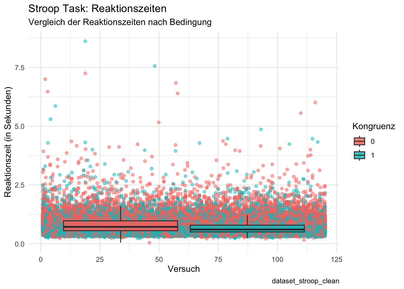
plot_all <- ggplot(d, aes(x = trial, y = rt)) +
geom_point(aes(color = factor(congruent)), position = position_jitter(width = 0.2), alpha = 0.5) + # Rohdaten anzeigen
geom_boxplot(aes(fill = factor(congruent)), alpha = 0.8, outlier.shape = NA) + # Zusammenfassende Boxplots
labs(title = "Stroop Task: Reaktionszeiten",
subtitle = "Vergleich der Reaktionszeiten nach Bedingung",
x = "Versuch",
y = "Reaktionszeit (in Sekunden)",
color = "Kongruenz",
fill = "Kongruenz",
caption = "dataset_stroop_clean") +
theme_minimal()
# Plot anzeigen
print(plot_all)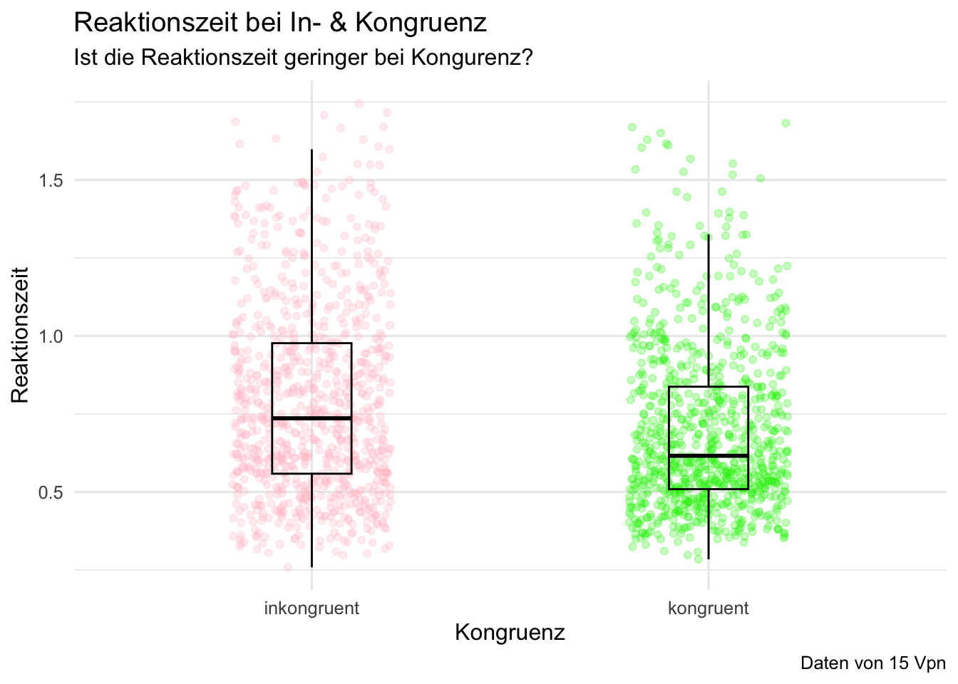
# Beginnen Sie hier mit Ihrem Code:

d <- d |>
    filter(rt > 0.1 & rt < 1.75) |>
    select(id, trial, congruent, rt)|>
    mutate (congruent = as.factor(congruent)) |>
    mutate(congruent = case_match(congruent,
                      "0" ~ "inkongruent",
                      "1" ~ "kongruent"))

p_boxplot <- d |>
    filter(id %in% c("sub-10318869", "sub-1106725", "sub-113945", "sub-11959984",
                     "sub-12224605", "sub-12242654", "sub-13366559", "sub-13662910",
                     "sub-13937586", "sub-13771505", "sub-73916681", "sub-74487595",
                     "sub-75143607", "sub-89031395", "sub-90289188")) |>
    ggplot(aes(x = congruent, y = rt, color = congruent)) +
    geom_jitter(alpha = 0.25, width = 0.2) +
    geom_boxplot(alpha = 0, width = 0.2, color = "black") +
    scale_color_manual(values = c(kongruent  = "green2",
                                  inkongruent = "pink")) +
    theme_minimal(base_size = 12) +
    theme(legend.position = "none") +
    labs(title = "Reaktionszeit bei In- & Kongruenz",
         subtitle = "Ist die Reaktionszeit geringer bei Kongurenz?",
         x = "Kongruenz",
         y = "Reaktionszeit",
         caption = "Daten von 15 Vpn" )

p_boxplot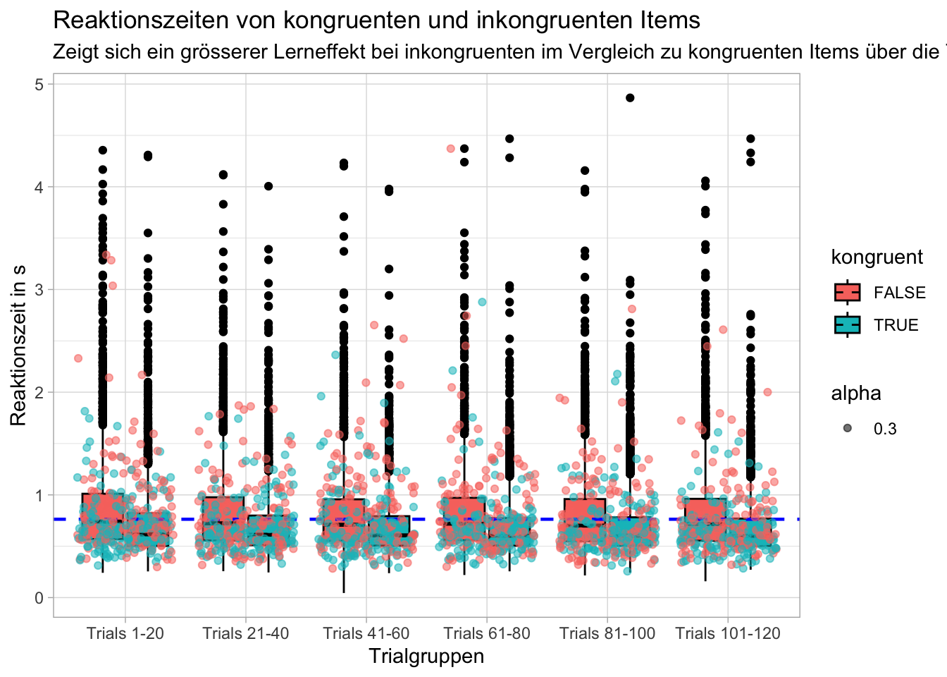
#Fragestellung: Zeigt sich ein grösserer Lerneffekt (der sich in einer schnelleren Reaktionszeit wiederspiegelt) bei inkongruenten im Verlgeich zu kongruenten Items über die Trials hinweg?

#Erstellen eines Datensatzes mit den für die Fragestellung relevanten Variablen ausgewählt werden und Gruppieren der Trials in 6 Trialgruppen
d_grouped <- d %>%
    na.omit() %>%
    group_by(trial) %>%
    reframe(id,
            rt,
            congruent = congruent == 1,
            trial_group = case_when(
                trial >= 1 & trial <= 20 ~ "Trials 1-20",
                trial >= 21 & trial <= 40 ~ "Trials 21-40",
                trial >= 41 & trial <= 60 ~ "Trials 41-60",
                trial >= 61 & trial <= 80 ~ "Trials 61-80",
                trial >= 81 & trial <= 100 ~ "Trials 81-100",
                trial >= 101 & trial <= 120 ~ "Trials 101-120"
            )) %>%
    mutate(trial_group = factor(trial_group, levels = c("Trials 1-20", "Trials 21-40", "Trials 41-60", "Trials 61-80", "Trials 81-100", "Trials 101-120")))

#Erstellen einer Variable die den Gesammittelwert der Variable Reaktionszeit beinhaltet
overall_mean <- mean(d$rt, na.rm = TRUE)

#Erstellen eines Datensatzes in dem zufällig Trials einzelner Teilnehmer:innen ausgewählt und gespeichert werden
random_participants <- d_grouped %>%
    filter(rt <= 5.0) %>%
    group_by(trial_group) %>%
    sample_n(300, replace = FALSE)

#Erstellen des Plots der die genannte Fragestellung beantwortet
p = d_grouped %>%
    filter(rt <= 5.0) %>%
    ggplot(mapping = aes(x = trial_group,
                         y = rt,
                         fill = congruent)) +
    geom_boxplot(color = "black") +
    geom_hline(yintercept = overall_mean, linetype = "dashed", color = "blue", size = 0.8) +
    geom_jitter(data = random_participants, aes(x = trial_group, y = rt, color = congruent, alpha = 0.3)) +
    labs(title = "Reaktionszeiten von kongruenten und inkongruenten Items",
         subtitle = "Zeigt sich ein grösserer Lerneffekt bei inkongruenten im Vergleich zu kongruenten Items über die Trials hinweg?",
         x = "Trialgruppen",
         y = "Reaktionszeit in s",
         fill = "kongruent",
         color = "kongruent") +
    theme_light()

p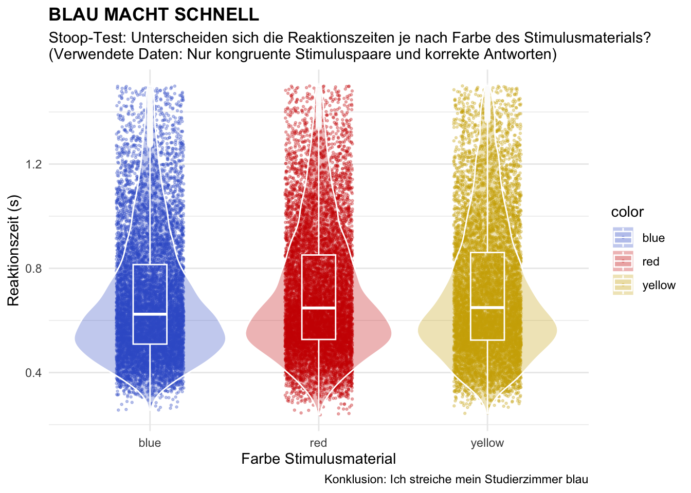
# Beginnen Sie hier mit Ihrem Code:

# daten vorbereiten
d_clean <- d %>%
    drop_na() %>%
    mutate(across(where(is.character),
           as.factor)) %>%  # aller text zu factors
    mutate(corr_fct = as.factor(corr),
           congr_fct = as.factor(congruent))  # neue vars mit corr und congr als fct
# plot
d_clean %>%
    filter(corr_fct == 1 & rt < 1.5) %>%
    ggplot(aes(
    x = color,
    y = rt,
    color = color,
    fill = color)) +
    geom_jitter(alpha = 0.3, width = 0.2, size = 0.5) +
    geom_violin(alpha = 0.3, color = "white") +
    geom_boxplot(alpha = 0.1, width = 0.2, color = "white") +
    theme_minimal() +
    labs(title = "BLAU MACHT SCHNELL",
         subtitle = "Stoop-Test: Unterscheiden sich die Reaktionszeiten je nach Farbe des Stimulusmaterials?
(Verwendete Daten: Nur kongruente Stimuluspaare und korrekte Antworten)",
         x = "Farbe Stimulusmaterial",
         y = "Reaktionszeit (s)",
         caption = "Konklusion: Ich streiche mein Studierzimmer blau") +
    theme(plot.title = element_text(face = "bold")) +
    scale_color_manual(values = c("blue" = "royalblue3",
                                  "red"="red3",
                                  "yellow"="gold3")) +
    scale_fill_manual(values = c("blue" = "royalblue3",
                                  "red"="red3",
                                  "yellow"="gold3"))


### links:
# https://www.statology.org/color-by-factor-ggplot2/
# https://sape.inf.usi.ch/quick-reference/ggplot2/colour
# https://kogpsy.github.io/neuroscicomplabFS24/pages/chapters/data_visualization_1.html
# https://kogpsy.github.io/neuroscicomplabFS24/pages/chapters/data_visualization_2.html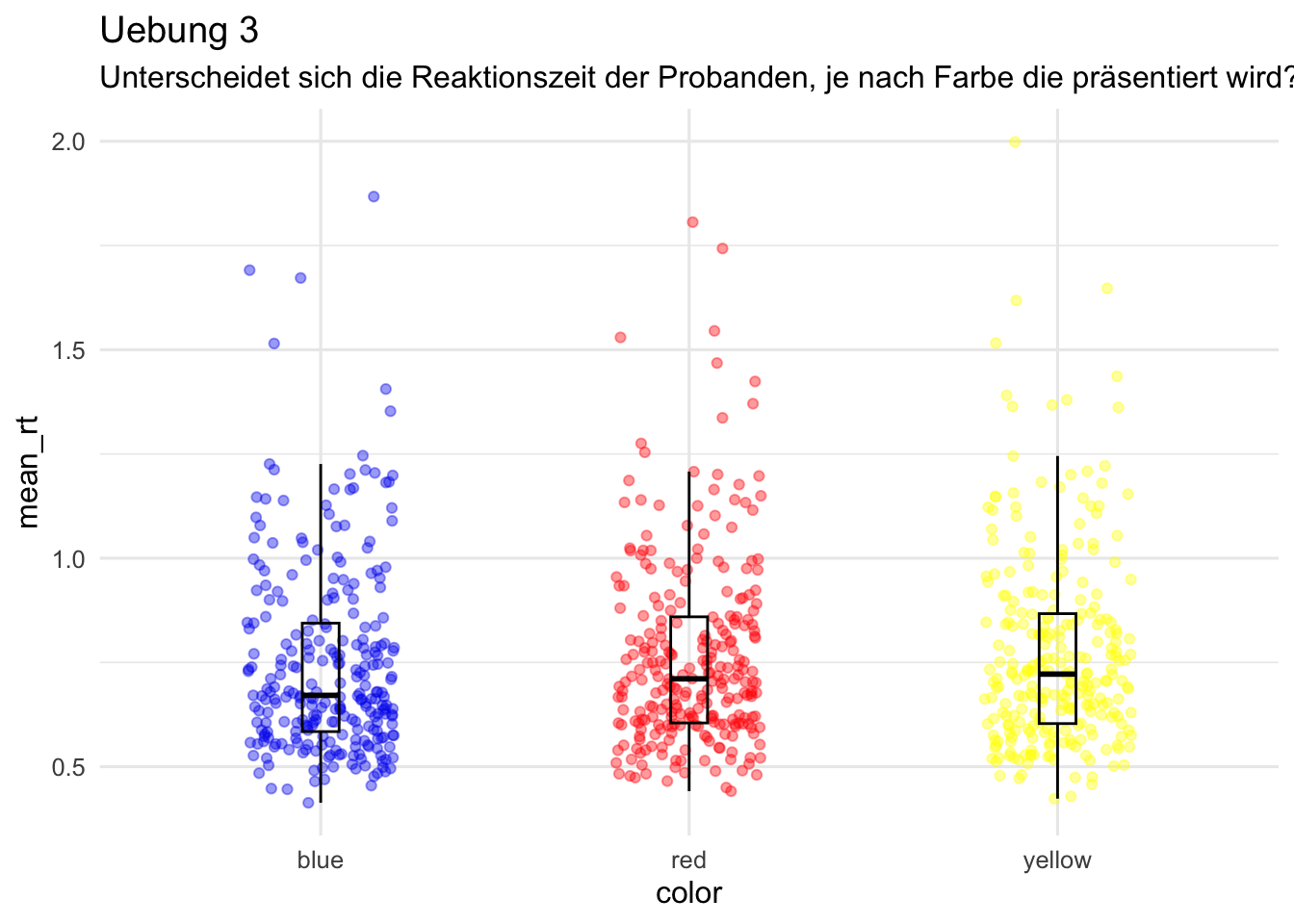
# Beginnen Sie hier mit Ihrem Code:

d <- d |>
  filter(rt > 0.09 & rt < 15)


d_color_rt <- d |>
  group_by(id, color) |>
  summarise(
    mean_rt = mean(rt)
  )


p = d_color_rt |>
  ggplot(aes(x = color, y = mean_rt, color = color)) +
  geom_jitter(size = 1.5, alpha = 0.4,
              width = 0.2, height = 0) +
  geom_boxplot(width = 0.1, alpha = 0, color = "black") +
  scale_color_manual(values = c(blue = "blue2",
                                red = "red1",
                                yellow = "yellow1")) +
  labs(title = "Uebung 3",
       subtitle = "Unterscheidet sich die Reaktionszeit der Probanden, je nach Farbe die präsentiert wird?") +
  theme_minimal(base_size = 12) +
  theme(legend.position = "none")

p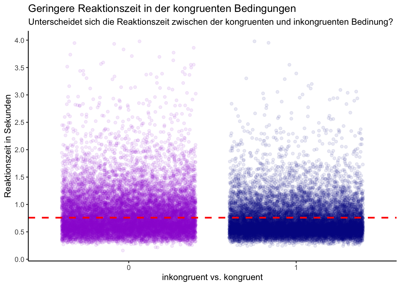
# Beginnen Sie hier mit Ihrem Code:
# library(ggplot2)

# Datensatz anschauen
# glimpse(d)

# unique(d$color)

d_congruent <- d %>%
    mutate(congruent = as.factor(congruent))%>%
    filter(rt < 4 & rt > 0.1)


d_rt_summary <- d_congruent %>%
summarise(mean_rt = mean(rt),
              sd_rt = sd(rt))


# glimpse(d_rt_summary)

#plot
p = d_congruent |>
    ggplot(mapping = aes(x =congruent ,
                         y = rt, color= congruent)) +
    geom_jitter(width = 0.4, alpha= 0.09) +
    scale_y_continuous(breaks = seq(0, 4, by = 0.5))+
    geom_hline(yintercept = d_rt_summary$mean_rt, linetype = "dashed", color = "red", linewidth= 1)+
    scale_color_manual(values= c("darkviolet", "darkblue"))+
    labs(title = "Geringere Reaktionszeit in der kongruenten Bedingungen",
         subtitle = "Unterscheidet sich die Reaktionszeit zwischen der kongruenten und inkongruenten Bedinung?",
         x = "inkongruent vs. kongruent",
         y = "Reaktionszeit in Sekunden") +
    theme_classic() +
    guides(color = FALSE)
p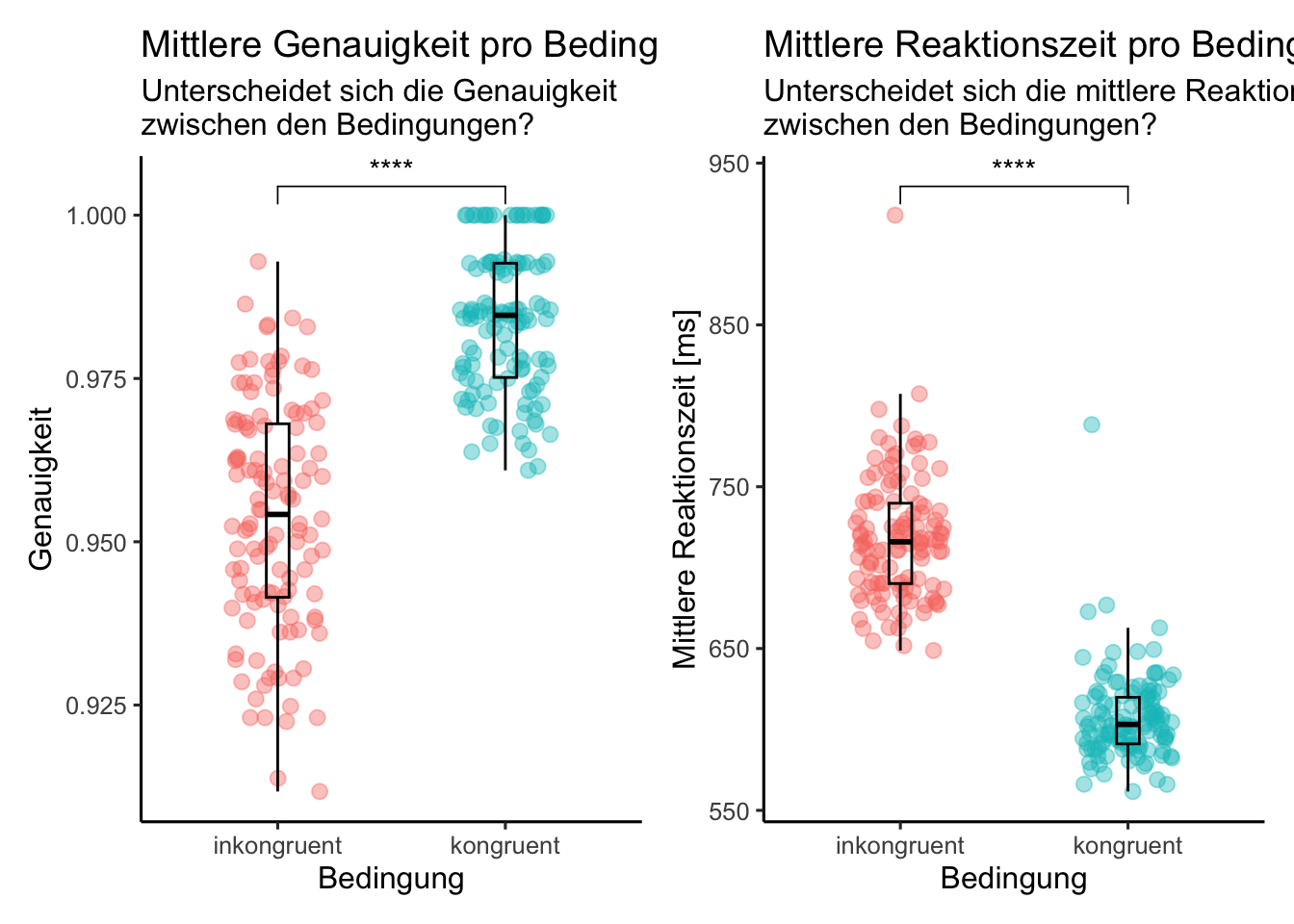
# Beginnen Sie hier mit Ihrem Code:

#Libraries laden
library(patchwork)
library(naniar)
library(psych)
library(ggpubr)

#Daten vorverarbeiten

d_factor <- d %>%
    mutate(across(where(is.character), as.factor))

d_filtered <- d_factor %>%
    filter(rt > 0.09 & rt < 15)


d_acc_rt_trial <- d_filtered %>%
    group_by(congruent, trial) %>%
    summarise(
        N = n(),
        ncorrect = sum(corr),
        accuracy = mean(corr),
        median_rt = median(rt)) %>%
    mutate(median_rt = median_rt*1000) %>%
    filter(accuracy > 0.5)

#Bedingungen in Faktor umwandeln und Levels umbenennen
d_acc_rt_trial$congruent_string <- factor(d_acc_rt_trial$congruent, levels = c("0", "1"))
levels(d_acc_rt_trial$congruent_string) <- list(inkongruent = "0", kongruent = "1")


#Plots erstellen
my_comparisonsp1 <- list(c("kongruent", "inkongruent"))

p1 <- d_acc_rt_trial %>%
    ggplot(aes(x = congruent_string, y= accuracy, color = congruent_string)) +
    geom_jitter(size = 2.5, alpha = 0.4,
                width = 0.2, height = 0) +
    geom_boxplot(width = 0.1, alpha = 0, color = "black") +
    labs(x = "Bedingung",
         y = "Genauigkeit",
         title = "Mittlere Genauigkeit pro Bedingung",
         subtitle = "Unterscheidet sich die Genauigkeit\nzwischen den Bedingungen?") +
    theme_classic(base_size = 12) +
    theme(legend.position = "none") +
    stat_compare_means(comparisons = my_comparisonsp1, label = "p.signif", method = "wilcox.test", paired = TRUE, ref.group = "inkongruent")


my_comparisonsp2 <- list(c("kongruent", "inkongruent"))

p2 <- d_acc_rt_trial %>%
    ggplot(aes(x = congruent_string, y= median_rt, color = congruent_string)) +
    geom_jitter(size = 2.5, alpha = 0.4,
                width = 0.2, height = 0) +
    geom_boxplot(width = 0.1, alpha = 0, color = "black") +
    labs(x = "Bedingung",
         y = "Mittlere Reaktionszeit [ms]",
         title = "Mittlere Reaktionszeit pro Bedingung",
         subtitle = "Unterscheidet sich die mittlere Reaktionszeit\nzwischen den Bedingungen?") +
    theme_classic(base_size = 12) +
    theme(legend.position = "none") +
    stat_compare_means(comparisons = my_comparisonsp1, label = "p.signif", method = "wilcox.test", paired = TRUE, ref.group = "inkongruent")

p1 + p2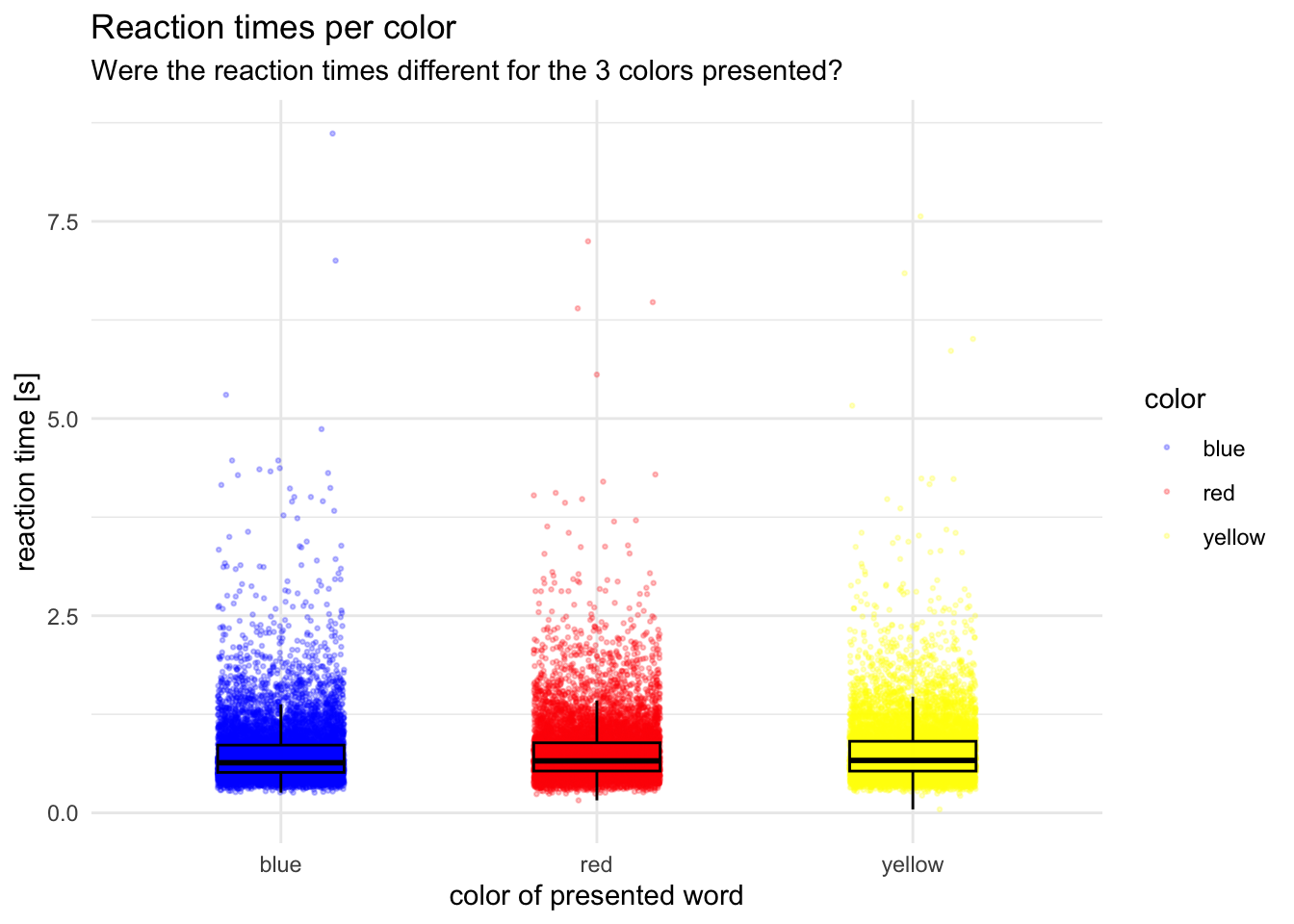
# Beginnen Sie hier mit Ihrem Code:

p = d |>
    ggplot(aes(x = color, y = rt, color = color)) +
    geom_jitter(width = 0.2, size = 0.5, alpha = 0.25) +
    geom_boxplot(width = 0.4, alpha = 0, color = "black") +
    scale_color_manual(values = c(blue = "blue",
                                 red = "red",
                                 yellow = "yellow")) +
    theme_minimal() +
    labs(x = "color of presented word",
         y = "reaction time [s]",
         title = "Reaction times per color",
         subtitle = "Were the reaction times different for the 3 colors presented?")

p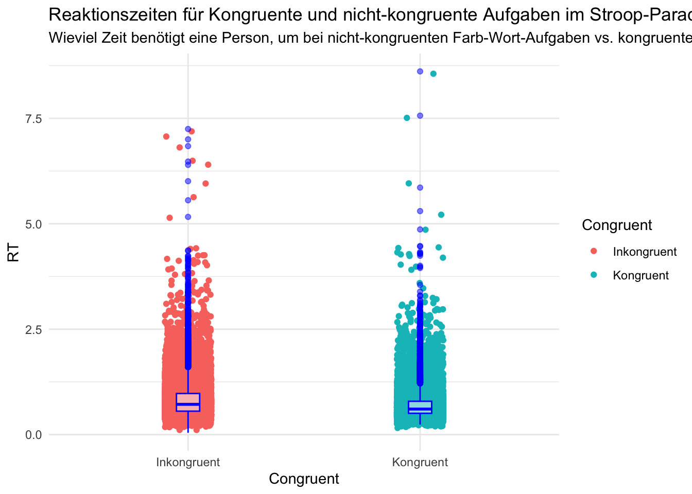
# Beginnen Sie hier mit Ihrem Code:
# Anmerkung: Habe noch versucht, Signifikanzwerte etc. anzeigen zu lassen (einfach aus Neugier) - vielleicht seht ihr das besser, ob es funktioniert hat.

library(ggsignif)

# Variable "congruent" in einen Faktor mit Labels "Inkongruent" bei 0, "Kongruent" bei 1
d$congruent <- factor(d$congruent, levels = c(0,1), labels = c("Inkongruent", "Kongruent"))

# Durchführung eines t-Tests
t_test_result <- t.test(rt ~ congruent, data = d, var.equal = FALSE)

# Extrahieren des p-Werts aus dem Testergebnis
p_value <- t_test_result$p.value

# Plotting mit ggplot
p <- ggplot(data = d,
            mapping = aes(x = congruent, y = rt, color = congruent)) +
  geom_jitter(height = 0.1, width = 0.1) +
  geom_boxplot(width = 0.1, color = "blue", fill = "white", alpha = 0.5) +  # Boxplot über den Dichteplot legen
  labs(title = "Reaktionszeiten für Kongruente und nicht-kongruente Aufgaben im Stroop-Paradigma",
       subtitle = "Wieviel Zeit benötigt eine Person, um bei nicht-kongruenten Farb-Wort-Aufgaben vs. kongruenten Farb-Wort-Aufgaben zu inhibieren?",
       x = "Congruent",
       y = "RT",
       color = "Congruent") +
  theme_minimal()

# Hinzufügen der Signifikanzanzeige
p <- p + geom_signif(comparisons = list(c("Incongruent", "Congruent")),
                     map_signif_level = TRUE,
                     textsize = 3,
                     vjust = 0.5,
                     manual = F) +
  annotate("text", x = 1.5, y = max(d$rt), label = ifelse(p_value < 0.05, "*", ""), size = 6)

# Plot anschauen
p


# Ursprüngliche Aufgabenstellung: Beides, Rohdaten UND mind. 1 zusammenfassendes Mass(z.B. Mittelwert mit Standardabweichungen, Box-/Violinplot, etc.). TIPP: Mehrere Geoms können übereinander gelegt werden.
# Mind. 2 unterschiedliche Farben.
# Beschriftungen: Titel, Subtitel, Achsenbeschriftungen, (optional: Captions)
# Der Subtitel beinhaltet die Frage, welche der Plot beantwortet.
# Ein Theme verwenden.
# Optional: Facets verwenden.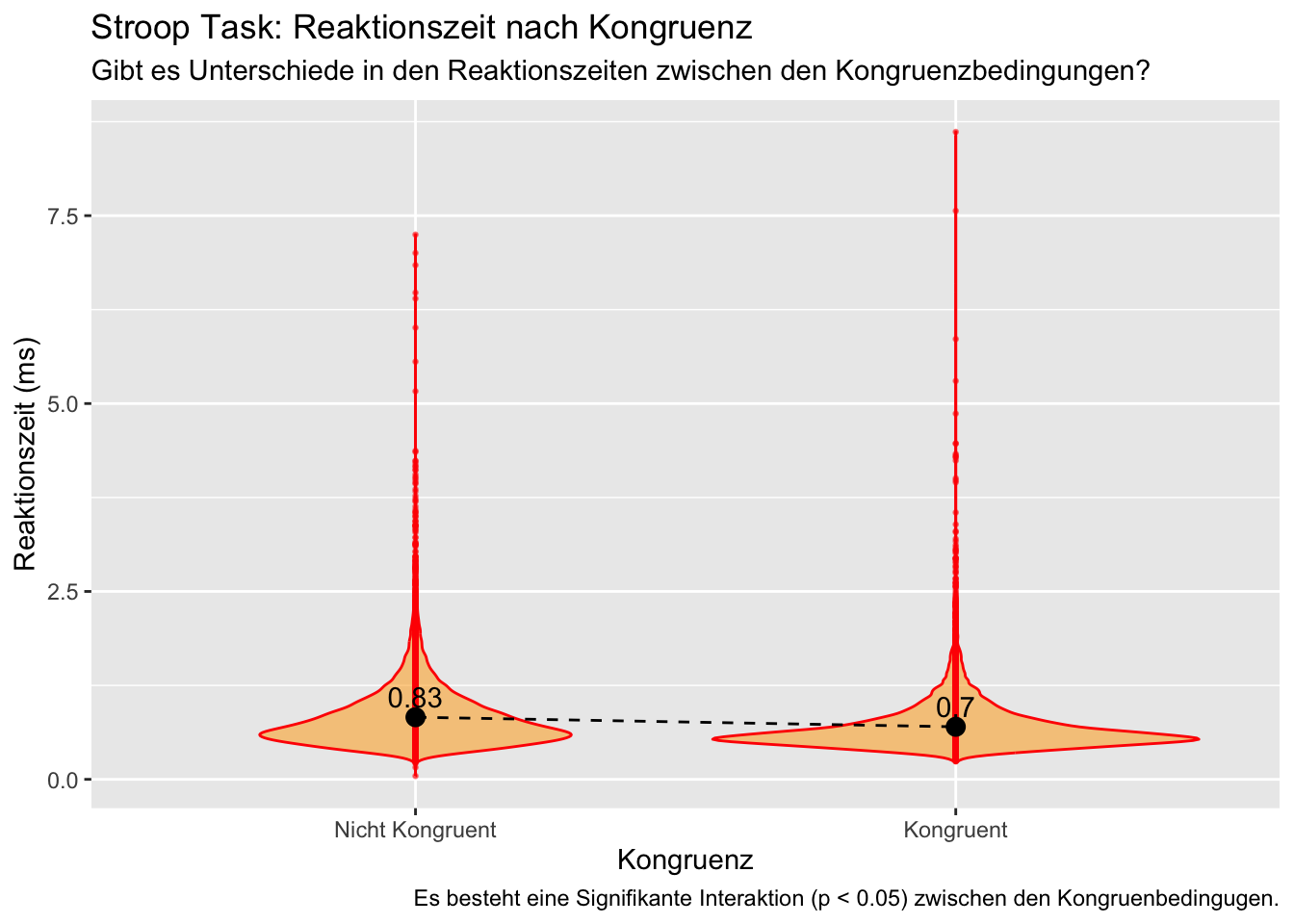
# Beginnen Sie hier mit Ihrem Code:

t_test_resultate <- t.test(rt ~ congruent, data = d)

p_wert <- t_test_resultate$p.value

signifikanz_label <- ifelse(p_wert < 0.05, "Es besteht eine Signifikante Interaktion (p < 0.05) zwischen den Kongruenbedingugen.", "Es besteht keine signifikante Interaktion (p >= 0.05) zwischen den Kongruenzbedingungen.")

p = d %>%
    ggplot(aes(x = as.factor(congruent), y = rt, fill = congruent)) +
    geom_violin(position = 'dodge', alpha = 0.5, color = "red", fill = "orange") +
    geom_point(size = 0.5, alpha = 0.5, color = "red") +
    stat_summary(fun = mean, geom = "point", size = 3, color = "black") +
    stat_summary(fun = mean, geom = "line", aes(group = 1), linetype = "dashed", color = "black") +
    stat_summary(fun = mean, geom = "text", aes(label = paste(round(..y.., digits = 2))), vjust = -0.5, color = "black") +
    labs(
        title = "Stroop Task: Reaktionszeit nach Kongruenz",
        subtitle = "Gibt es Unterschiede in den Reaktionszeiten zwischen den Kongruenzbedingungen?",
        x = "Kongruenz",
        y = "Reaktionszeit (ms)",
        caption = signifikanz_label) +
    theme_grey() +
    theme(legend.position = "none") +
    scale_x_discrete(
        breaks = c(0, 1),
        labels = c("Nicht Kongruent", "Kongruent")
    )

p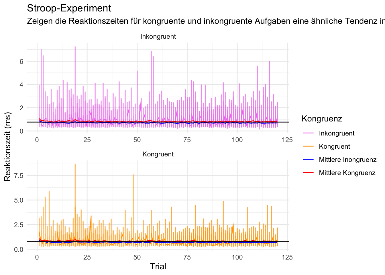
# Zu langsame und zu schnelle herausfiltern
d <- d |>
  filter(rt > 0.09 & rt < 15)

# Daten gruppieren:  Anzahl Trials, Accuracy und mittlere Reaktionszeit berechnen
acc_rt_individual <- d |>
  group_by(id, congruent) |>
  summarise(
    N = n(),
    ncorrect = sum(corr),
    accuracy = mean(corr),
    median_rt = median(rt)
  )

# Datensatz mit allen Ids, welche zuwenig Trials hatten
n_exclusions <- acc_rt_individual |>
  filter(N < 40)

# Aus dem Hauptdatensatz diese Ids ausschliessen
d <- d |>
  filter(!id %in% n_exclusions$id)

# Check
d_acc_rt_individual <- d |>
  group_by(id, congruent) |>
  summarise(
    N = n(),
    ncorrect = sum(corr),
    accuracy = mean(corr),
    median_rt = median(rt)
  )

# Gesamtmittelwert und Mittelwerte Reaktionszeit berechnen
overall_mean_rt <- mean(d$rt)

avg_rt_congruent <- aggregate(rt ~ trial, data = d[d$congruent == 1, ], FUN = mean)
avg_rt_incongruent <- aggregate(rt ~ trial, data = d[d$congruent == 0, ], FUN = mean)

# Plot erstellen
p <- d |>
  ggplot(aes(x = trial, y = rt, color = factor(congruent))) +
  geom_line() +
  geom_line(data = avg_rt_congruent, aes(y = rt, color = "Kongruent")) +
  geom_line(data = avg_rt_incongruent, aes(y = rt, color = "Inkongruent")) +
  geom_hline(yintercept = overall_mean_rt, linetype = "solid", color = "black") +
  labs(title = "Stroop-Experiment",
       subtitle = "Zeigen die Reaktionszeiten für kongruente und inkongruente Aufgaben eine ähnliche Tendenz im Verlauf der Trials verglichen zur mittleren Reaktionszeit?",
       x = "Trial",
       y = "Reaktionszeit (ms)") +
  scale_color_manual(values = c("violet", "orange", "blue", "red"),
                     labels = c("Inkongruent", "Kongruent", "Mittlere Inongruenz", "Mittlere Kongruenz"),
                     name = "Kongruenz") +
  facet_wrap(~ factor(congruent, levels = c(0, 1), labels = c("Inkongruent", "Kongruent")), scales = "free", ncol = 1) +
  theme_minimal()

print(p)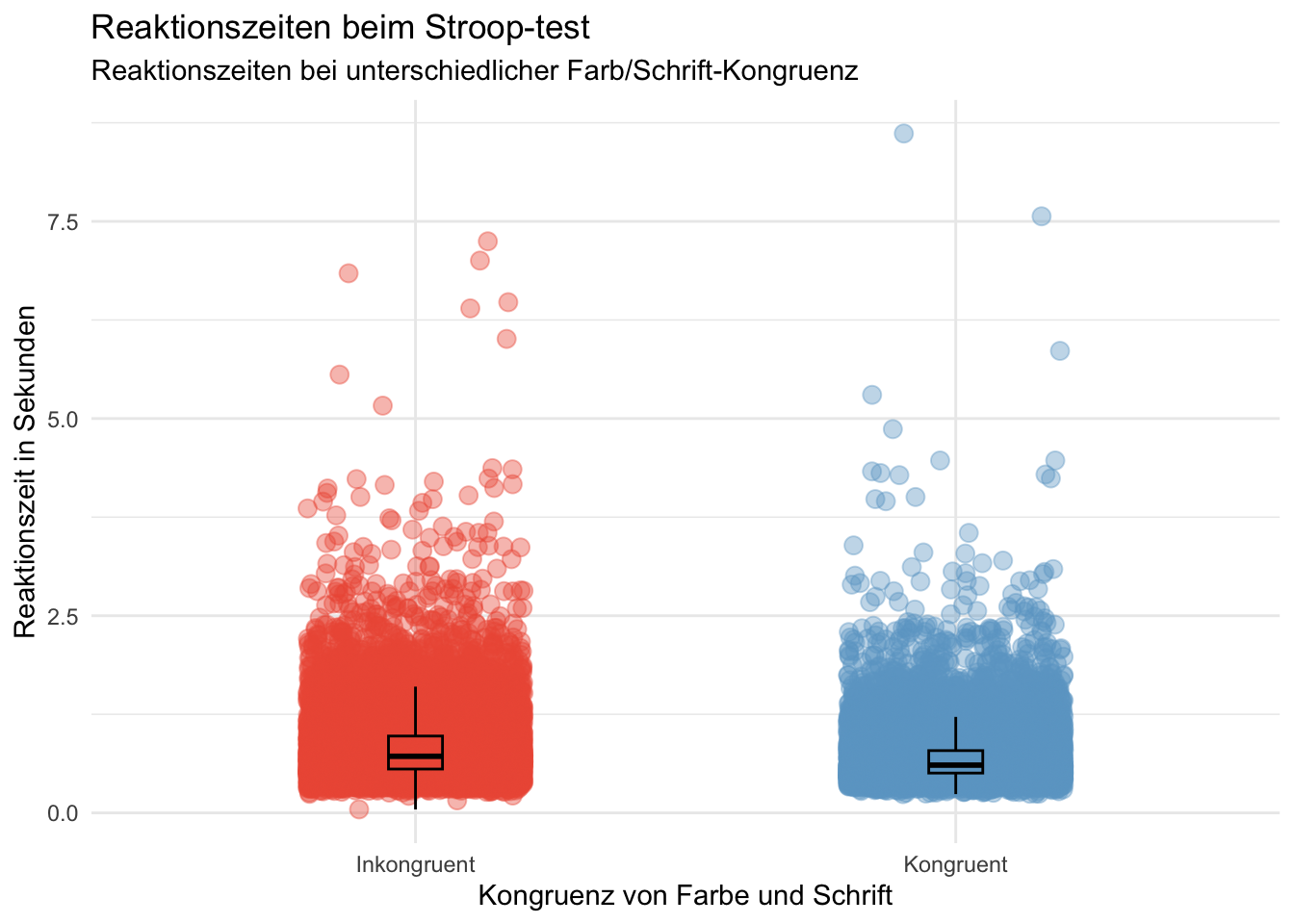
# Beginnen Sie hier mit Ihrem Code:

d$congruent <- factor(d$congruent, levels = c(0, 1), labels = c("Inkongruent", "Kongruent"))

p <-  ggplot(d, aes(x = congruent, y = rt, color = congruent)) +
    geom_jitter(size = 3, alpha = 0.4, width = 0.2, height = 0) +
    geom_boxplot(width = 0.1, alpha = 0, color = "black") +
    scale_color_manual(values = c("Inkongruent" = "tomato2", "Kongruent" = "skyblue3")) +
    labs(title = "Reaktionszeiten beim Stroop-test",
         subtitle = "Reaktionszeiten bei unterschiedlicher Farb/Schrift-Kongruenz",
         x = "Kongruenz von Farbe und Schrift",
         y = "Reaktionszeit in Sekunden") +
    theme_minimal() +
    guides(color = FALSE)
p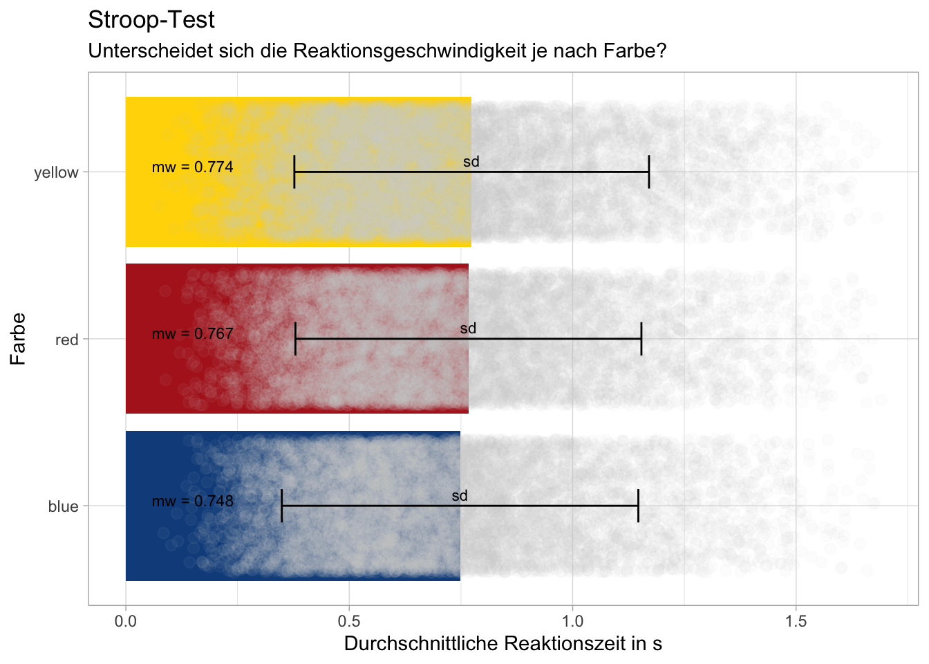
# Beginnen Sie hier mit Ihrem Code:
#Frage: Unterscheidet sich die Geschwindigkeit je nach Farbe?

# Daten zusammenfassen und fehlende Werte entfernen
d_summary <- d %>%
    filter(!is.na(rt)) %>%
    group_by(color) %>%
    summarise(mean_rt = mean(rt),
              sd_rt = sd(rt)) # Standardabweichung berechnen
# glimpse(d_summary)

#Rohdaten verarbeiten damit nur relevanter Bereich gezeigt wird
d = d %>% filter(rt<1.5)

# Erstellen einer Zuordnung von Farben zu Farben
color_mapping <- c("blue" = "dodgerblue4", "red" = "firebrick", "yellow" = "gold")

# ggplot mit individuellen Farben für jeden Balken, Standardabweichung und Rohdaten

p <- ggplot(d_summary, aes(y = color, x = mean_rt, fill = color)) +
    geom_bar(stat = 'identity') +
    geom_point(data = d, aes(x = rt, group = color), position = position_jitter(width = 0.2), color = "lightgrey", size = 2.5, alpha = 0.05)+
    geom_errorbar(aes(xmin = mean_rt - sd_rt, xmax = mean_rt + sd_rt), width = 0.2)+ # Fehlerbalken für Standardabweichung
    geom_text(aes(label = paste("mw =", round(mean_rt, 3)), x = 0.15), vjust = 0, color = "black", size = 3) + # Mittelwert als Zahl in die Balken schreiben
    geom_text(aes(label = paste("sd")), vjust = -0.5, color = "black", size = 3)+ # sd beschriften
    scale_fill_manual(values = color_mapping) +
    labs(title = "Stroop-Test",
         subtitle = "Unterscheidet sich die Reaktionsgeschwindigkeit je nach Farbe?",
         y = "Farbe",
         x = "Durchschnittliche Reaktionszeit in s")+
    theme_light() +
    theme(legend.position = "none")  # Farbskala entfernen
p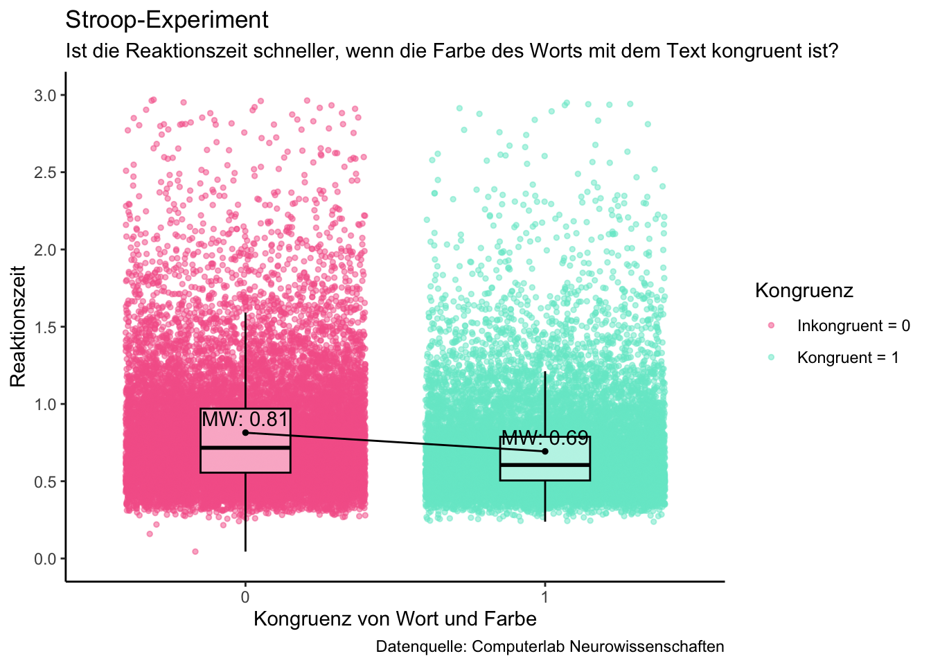
# Beginnen Sie hier mit Ihrem Code:

d <- d %>% mutate(congruent = as.factor(congruent))

palette <- c ("#F56598", "#74E8CE")

#Fragestellung: Ist die Reaktionszeit schneller, wenn die Farbe des Worts mit dem Text übereinstimmt?
# glimpse(d)
minigrafik = d |>
    ggplot(mapping =
           aes(x = congruent,
               y = rt,
               color = congruent,
               fill = congruent)) +
    geom_jitter(size= 1,
                alpha = 0.5,) +
    geom_boxplot(width = 0.3, fill = "white", color ="black", alpha = 0.5, outlier.colour = "black", outlier.shape = NA) +
    scale_color_manual(values = palette, name = "Kongruenz", labels = c("Inkongruent = 0", "Kongruent = 1")) +
    scale_fill_manual(values = palette) +

    # Mittelwert
    stat_summary(fun=mean,
                 geom="point",
                 shape=19,
                 size=1,
                 color="black",
                 fill="black",
                 position=position_dodge(width=0.5)) +

    # Linie um Mittelwert-Differenz darzustellen
    stat_summary(fun=mean,
                geom="line",
                aes(group=1),
                linetype="solid",
                color="black",
                position=position_dodge(width=0.5)) +

    # Mittelwert beschriften
    geom_text(aes(label = paste("MW:", round(..y.., 2))),
              stat = "summary",
              vjust = -0.5,
              color = "black",
              fill = "black",
              position=position_dodge(width=0.5))  +

    # Achsenbeschriftung
    labs(title = "Stroop-Experiment",
         subtitle = "Ist die Reaktionszeit schneller, wenn die Farbe des Worts mit dem Text kongruent ist?",
         x = "Kongruenz von Wort und Farbe",
         y = "Reaktionszeit",
         caption = "Datenquelle: Computerlab Neurowissenschaften") +

    # Definiert die Achsenskalierung für die y-Achse
    scale_y_continuous(limits = c(0, 3), breaks = seq(0, 3, by = 0.5)) +

    guides(fill = FALSE) +
    theme_classic()

minigrafik

#ggsave(filename = "grafik_yael_hess.png",
#       plot = minigrafik)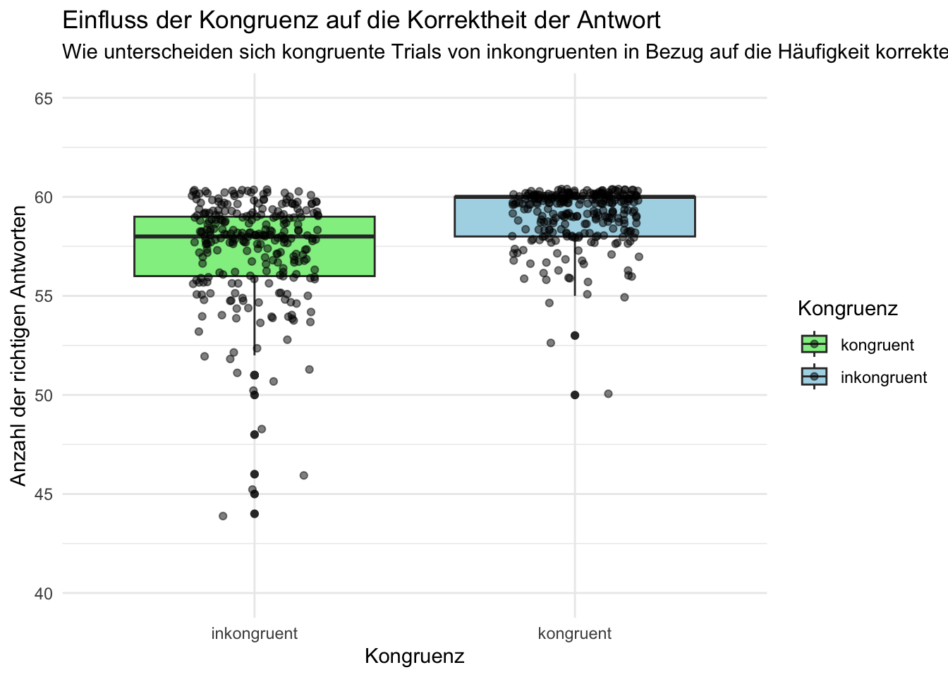
d_grouped_and_summarized <- d %>%
    group_by(id, congruent) %>%
    summarise(
        sum_corr = sum(corr),
        mean_corr = mean(sum_corr)
    )

p = ggplot(data = d_grouped_and_summarized,
       aes(x = factor(congruent),
           y = mean_corr,
           fill = factor(congruent))) +
    geom_boxplot() +
    geom_point(position = position_jitter(width = 0.2), alpha = 0.5) +
    labs(x = "Kongruenz", y = "Anzahl der richtigen Antworten", fill = "Kongruenz") +
    scale_fill_manual(values = c("1" = "lightblue", "0" = "lightgreen"),
                      labels = c("kongruent", "inkongruent")) +
    scale_x_discrete(labels = c("1" = "kongruent", "0" = "inkongruent")) +  # Ändern der Labels auf der x-Achse
    coord_cartesian(ylim = c(40, 65)) + # limitieren der Spannweite der y-Achse zur besseren Übersicht
    theme_minimal() +
    theme(legend.position = "right") +
    ggtitle("Einfluss der Kongruenz auf die Korrektheit der Antwort") +  # Titel hinzufügen
    labs(subtitle = "Wie unterscheiden sich kongruente Trials von inkongruenten in Bezug auf die Häufigkeit korrekter Antworten?")  # Untertitel hinzufügen
p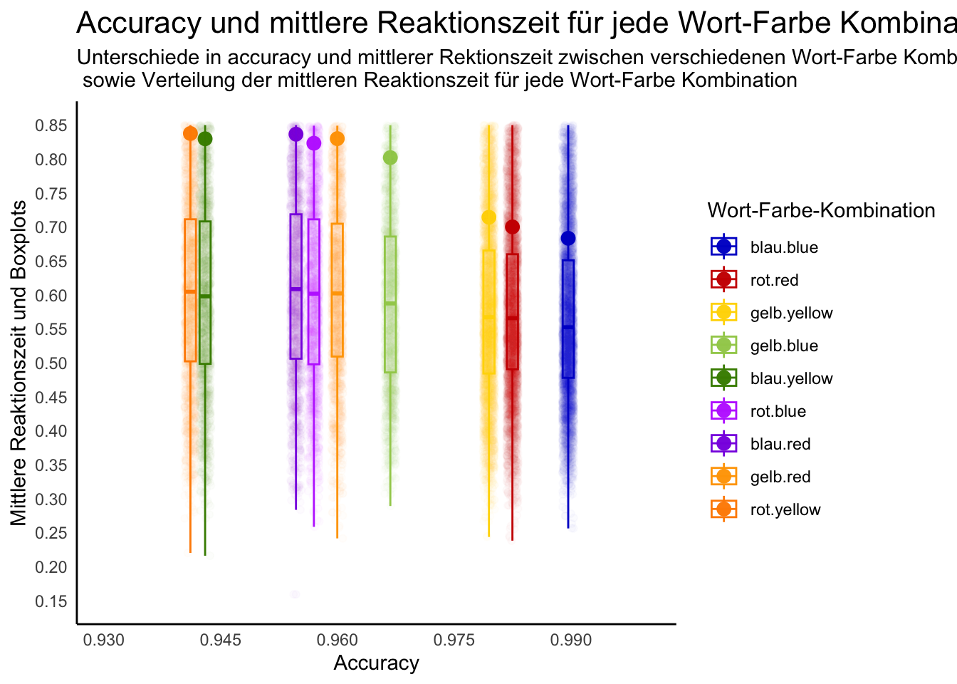
# Beginnen Sie hier mit Ihrem Code:

d_point <- d %>%
    group_by(word, color) %>%
    na.omit() %>%
    summarize(mean_rt = mean(rt),
              accuracy = mean(corr)) %>%
    mutate(interaction_word_color = factor(interaction(word, color), levels = c("blau.blue", "rot.red", "gelb.yellow", "gelb.blue", "blau.yellow", "rot.blue", "blau.red", "gelb.red", "rot.yellow")))

d_jitter <- d %>%
    group_by(word, color) %>%
    na.omit() %>%
    summarize(rt = rt,
              accuracy = mean(corr)) %>%
    mutate(interaction_word_color = factor(interaction(word, color), levels = c("blau.blue", "rot.red", "gelb.yellow", "gelb.blue", "blau.yellow", "rot.blue", "blau.red", "gelb.red", "rot.yellow")))

d_boxplot <- d %>%
    group_by(word, color) %>%
    na.omit() %>%
    summarize(rt = rt,
              accuracy = mean(corr)) %>%
    mutate(interaction_word_color = factor(interaction(word, color), levels = c("blau.blue", "rot.red", "gelb.yellow", "gelb.blue", "blau.yellow", "rot.blue", "blau.red", "gelb.red", "rot.yellow")))

p <- d %>%
    ggplot() +
    geom_point(data = d_point, mapping = aes(x = accuracy, y = mean_rt, color = interaction_word_color), size = 3) +
    geom_jitter(data = d_jitter, mapping = aes(x = accuracy, y = rt, color = interaction_word_color), alpha = 0.016) +
    geom_boxplot(data = d_boxplot, mapping = aes(x = accuracy, y = rt, color = interaction_word_color), alpha = 0.02)+
    scale_color_manual(values = c("blue3", "red3", "gold", "darkolivegreen3", "chartreuse4", "darkorchid1", "blueviolet", "orange", "darkorange"), name = "Wort-Farbe-Kombination", guide_legend(override.aes = list(size = 5))) +
    labs(y = "Mittlere Reaktionszeit und Boxplots", x = "Accuracy", title = "Accuracy und mittlere Reaktionszeit für jede Wort-Farbe Kombination", subtitle = "Unterschiede in accuracy und mittlerer Rektionszeit zwischen verschiedenen Wort-Farbe Kombinationen \n sowie Verteilung der mittleren Reaktionszeit für jede Wort-Farbe Kombination") +
    theme_minimal() +
    theme(panel.grid.major = element_blank(),
          panel.grid.minor = element_blank(),
          panel.border = element_blank(),
          axis.line = element_line(size = 0.5, color = "black"),
          plot.title = element_text(size = 16)) +
    theme(panel.grid = element_blank()) +
    scale_x_continuous(limits = c(0.93, 1), breaks = seq(0.93, 1.02, 0.015)) +
    scale_y_continuous(limits = c(0.15, 0.85), breaks = seq(0.15, 0.85, 0.05))

p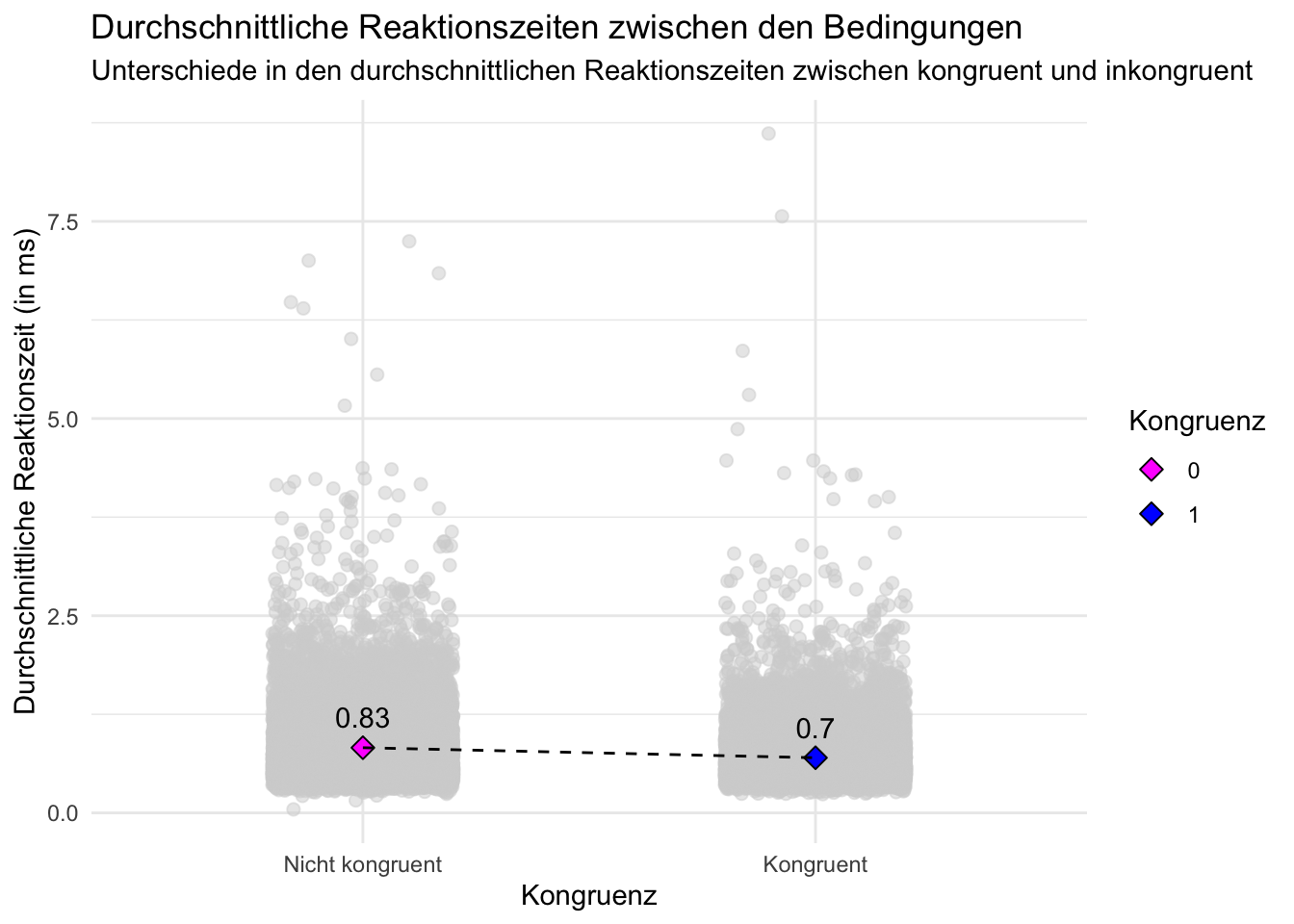
# Beginnen Sie hier mit Ihrem Code:

# Rohdaten und Zusammenfassung
p <- d %>%
  ggplot(aes(x = as.factor(congruent), y = rt, fill = as.factor(congruent))) +
  geom_jitter( width = 0.2, alpha = 0.5, size = 2, color = "lightgrey") +
  stat_summary(fun = mean, geom = "point", shape = 23, size = 3, position = position_dodge(width = 0.75)) +
  stat_summary(fun = mean, geom = "errorbar", position = position_dodge(width = 0.75), width = 0.3, color = "black", size = 1.5) +
  geom_line(stat = "summary", aes(group = 1), position = position_dodge(width = 0.75), linetype = "dashed") +
  geom_text(stat = "summary", aes(label = round(..y.., 2)), vjust = -1, position = position_dodge(width = 0.8)) +
  labs(
    title = "Durchschnittliche Reaktionszeiten zwischen den Bedingungen",
    subtitle = "Unterschiede in den durchschnittlichen Reaktionszeiten zwischen kongruent und inkongruent",
    x = "Kongruenz",
    y = "Durchschnittliche Reaktionszeit (in ms)",
    fill = "Kongruenz"
  ) +
  scale_fill_manual(values = c("magenta","blue")) +
  scale_x_discrete(labels = c("Nicht kongruent","Kongruent")) +
  theme_minimal()

print(p)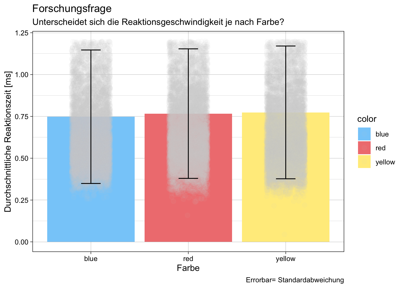
# Beginnen Sie hier mit Ihrem Code:
#Frage: Unterscheidet sich die Geschwindigkeit je nach Farbe?

# Daten zusammenfassen und fehlende Werte entfernen
d_summary <- d %>%
    filter(!is.na(rt)) %>%
    group_by(color) %>%
    summarise(mean_rt = mean(rt),
              sd_rt = sd(rt))
# glimpse(d_summary)

#Rohdaten verarbeiten damit nur ein reduzierter Bereich gezeigt wird (dort wo MW & SD liegen)
d= d %>%
    filter(rt<1.2)


# Erstellen einer Zuordnung von Farben zu Farben
color_mapping <- c("blue" = "lightskyblue", "red" = "lightcoral", "yellow" = "lightgoldenrod1")

# ggplot mit MW,SD & individuellen Datenpunkten

p<- ggplot(d_summary, aes(x = color, y = mean_rt, fill = color)) +
    geom_bar(stat = 'identity') +
    geom_point(data = d, aes(y = rt, group = color), position = position_jitter(width = 0.2), color = "lightgrey", size = 2.5, alpha=0.05)+
    geom_errorbar(aes(ymin = mean_rt - sd_rt, ymax = mean_rt + sd_rt), width = 0.2)+ # errorbars=sd
    scale_fill_manual(values = color_mapping) +
    labs(title = "Forschungsfrage",
         subtitle = "Unterscheidet sich die Reaktionsgeschwindigkeit je nach Farbe?",
         x = "Farbe",
         y = "Durchschnittliche Reaktionszeit [ms]",
         caption= "Errorbar= Standardabweichung")+
    theme_linedraw()
p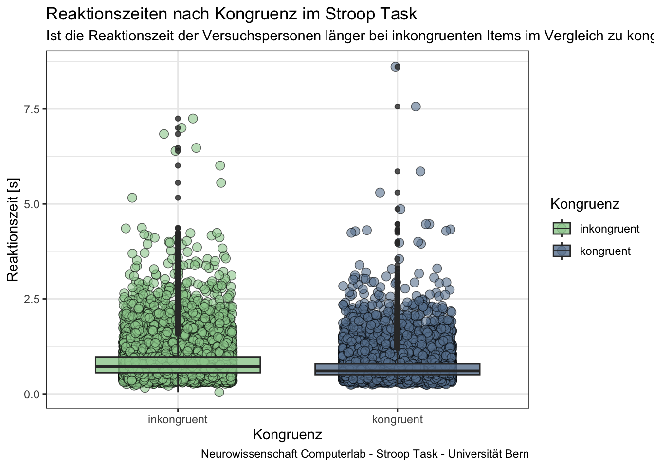
# Beginnen Sie hier mit Ihrem Code:

# Fragestellung:
# Ist die Reaktionszeit der Versuchspersonen länger bei inkongruenten Items im Vergleich zu kongruenten Items?

# Daten bereinigen und Überblick verschaffen:
d_clean <- d %>%
  filter(!is.na(rt))

summary_data <- d_clean %>%
  group_by(congruent) %>%
  summarize(median_rt = median(rt),
            mean_rt = mean(rt),
            sd_rt = sd(rt))

# Anzeigen der summary
# summary_data

# congruent zu Faktor umwandeln (inkongruent = 0; kongruent = 1)
d_final <- d_clean %>%
  mutate(congruent = factor(congruent))


# Plot erstellen
p <- ggplot(d_final, aes(x = congruent, y = rt, fill = congruent)) +
  geom_jitter(width = 0.25, alpha = 0.6, color = "#000000", shape = 21, size = 3, stroke = 0.4) +
  geom_boxplot(alpha = 0.8) +
  labs(title = "Reaktionszeiten nach Kongruenz im Stroop Task",
       subtitle = "Ist die Reaktionszeit der Versuchspersonen länger bei inkongruenten Items im Vergleich zu kongruenten Items?",
       x = "Kongruenz",
       y = "Reaktionszeit [s]",
       fill = "Kongruenz",
       caption = "Neurowissenschaft Computerlab - Stroop Task - Universität Bern") +
  scale_fill_manual(values = c("#9bcd9b", "#68829E"), labels = c("inkongruent", "kongruent")) +
  scale_x_discrete(labels = c("inkongruent", "kongruent")) +
  theme_bw()

# Plot anzeigen
p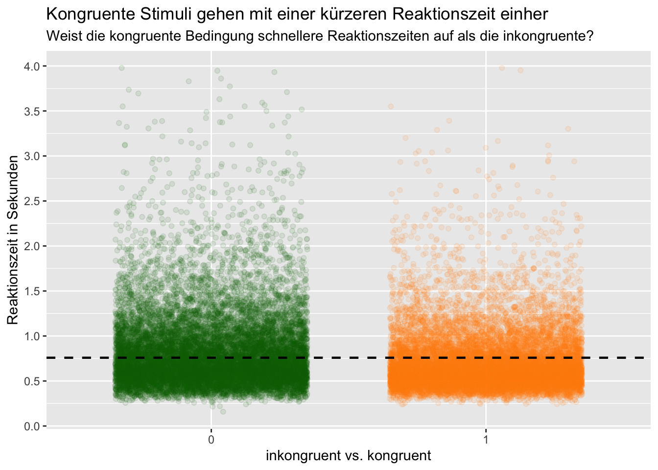
# Beginnen Sie hier mit Ihrem Code:

# Fragestellung: Reaktionszeit bei kongruenten oder bei inkroguenten Stimuli + mean von rt in Form von Linie einfügen zum Vergleich
# glimpse(d)

#Variable congruent in Faktor umrechnen weil sonst alle Werte möglich zwischen 0 & 1
d1 <- d %>%
    mutate(congruent = as.factor(congruent)) %>%
    filter(rt < 4 & rt > 0.1)

#Mittelwert von rt bilden um diesen als Vergleich in den plot einzufügen
d2 <- d1 %>%
    summarise(mean_rt = mean(rt),
              sd_rt = sd(rt))
#Plot
p = d1 %>%
    ggplot(mapping = aes(x = congruent, y = rt, color = congruent)) +
    scale_y_continuous(breaks = seq(0, 4, by = 0.5)) +
    geom_jitter(width = 0.35, alpha = 0.1) +
    geom_hline(yintercept = d2$mean_rt, linetype = "dashed", color = "black", linewidth = 0.8) +
    scale_color_manual(values = c("darkgreen", "darkorange")) +
    labs(title = "Kongruente Stimuli gehen mit einer kürzeren Reaktionszeit einher",
         subtitle = "Weist die kongruente Bedingung schnellere Reaktionszeiten auf als die inkongruente?",
         x = "inkongruent vs. kongruent",
         y = "Reaktionszeit in Sekunden") +
    guides(color = FALSE) #Ausblenden der Farb-Legende
    # theme_classic()
p

#glimpse(p)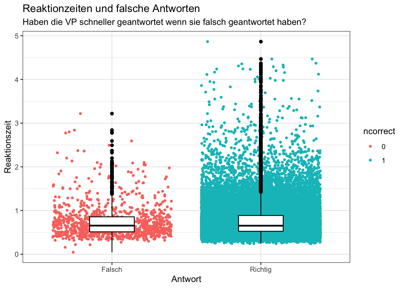
# Beginnen Sie hier mit Ihrem Code:

# glimpse(d)

#Datensatz gruppiert und summarized anhand der für die Beantwortung der Fragestellung relevanten Daten.
d_grouped_and_summarized_data <- d |>
  mutate(corr = as.factor(corr))|>
  group_by(id, corr, rt)|>
  summarise(
    ncorrect = corr,
  )

#Plot erstellt anhand des erstellten Datensatzes
p = d_grouped_and_summarized_data |>
  filter(rt < 5)|>
  ggplot(mapping =
           aes(x= ncorrect, y= rt, color = ncorrect)) +
  geom_jitter(size= 1, width= 0.4) +
  geom_boxplot(width = 0.3, color= "black") +
  labs(title = "Reaktionzeiten und falsche Antworten",
       subtitle = "Haben die VP schneller geantwortet wenn sie falsch geantwortet haben?",
       x="Antwort",
       y = "Reaktionszeit")+
  scale_x_discrete(labels = c("Falsch", "Richtig"))+
  theme_bw()

#Ausgabe des Plots
p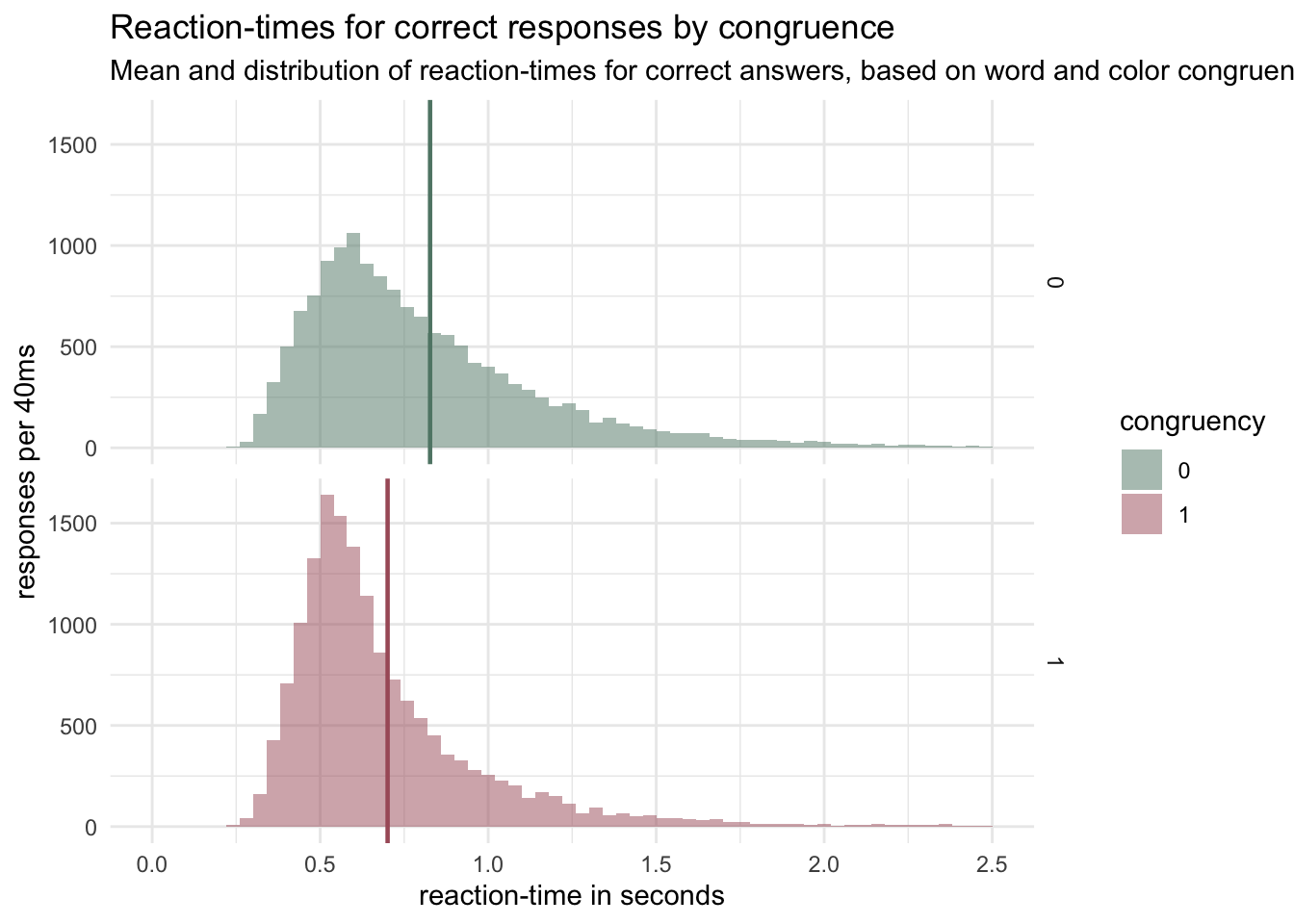
# Beginnen Sie hier mit Ihrem Code:

d$congruent <- as.factor(d$congruent) # changing 'congruent' to factor

d_agr <- d %>% filter(corr == 1)%>%
    group_by(congruent) %>%
    na.omit() %>%
    summarise(mean = mean(rt)) # creating a vector with the mean of all correct responses for congruent and incongruent trials.

colors_1 <- c("#5F8575", "#A95C68") # vector for the colors used in geom_hline and geom_histogram

p <- d %>% filter(corr == 1) %>% # filter only correct trials
    group_by(congruent) %>% ggplot(aes(x = rt, fill = congruent)) +
    geom_histogram( linetype = 0 ,
                    alpha=0.5,
                    position = 'identity',
                    binwidth= 0.04 ) + # binwidth set to 40ms
    scale_fill_manual(values=colors_1) +
    facet_grid(congruent ~ .) + # seperating the distrbutions, as the overlap is messy.
    xlim(0, 2.5) +
    geom_vline(data= d_agr , aes(xintercept= mean, color= congruent),
               linetype="solid", size = 0.8, color = colors_1) + # a line with colors of distribution for the mean
    theme_minimal() + #theme
    ggtitle("Reaction-times for correct responses by congruence") + # descriptions
    labs(fill = "congruency",
         x = "reaction-time in seconds",
         y = "responses per 40ms",
         subtitle = "Mean and distribution of reaction-times for correct answers, based on word and color congruence (1) or incongruence (0)")


p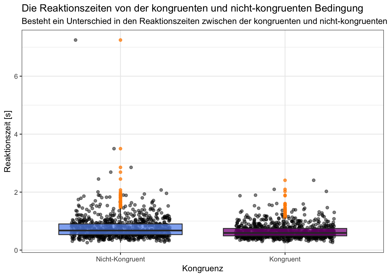
# Beginnen Sie hier mit Ihrem Code:

d$congruent <- factor(d$congruent, levels = c(0, 1), labels = c("Nicht-Kongruent", "Kongruent"))

# Zufällige Auswahl von 15 Personen
random_ids <- sample(unique(d$id), 15)

r_d <- d %>%
    filter(id %in% random_ids)

p = r_d |>
    ggplot(aes(x = congruent, y = rt, fill = congruent)) +
    geom_jitter(width = 0.3, alpha = 0.5) +
    geom_boxplot(outlier.color = "darkorange", alpha = 0.75) +
    scale_fill_manual(values = c("cornflowerblue", "darkmagenta")) +
    labs(title = "Die Reaktionszeiten von der kongruenten und nicht-kongruenten Bedingung",
         subtitle = "Besteht ein Unterschied in den Reaktionszeiten zwischen der kongruenten und nicht-kongruenten Bedingung?",
         x = "Kongruenz",
         y = "Reaktionszeit [s]") +
    theme_bw() +
    theme(legend.position = "none")

print(p)[1] "incongruence" "congruence" 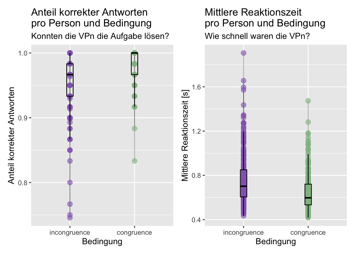
# Beginnen Sie hier mit Ihrem Code:
# Datensatz anschauen
# glimpse(d)

#zu Factors machen
d <- mutate(d, color = as.factor(color),
            condition = as.factor(congruent))

levels (d$condition) [levels (d$condition) == '0'] <- 'incongruence'
levels (d$condition) [levels (d$condition) == '1'] <- 'congruence'
levels (d$condition)

# glimpse(d)
#Diagnostik: Daten untersuchen

#Fehlende Werte
# install.packages("naniar")
library(naniar)
# naniar::vis_miss(d)

#zu schnelle und zu langsame Antworten ausschliessen
d <- d |>
    filter(rt > 0.09 & rt < 15)

#Person mit correct 1 ausschliessen
d <- d |>
    filter(id != "sub-80444009")

# Daten gruppieren:  Anzahl Trials, Accuracy und mittlere Reaktionszeit berechnen
acc_rt_individual <- d |>
    group_by(id, condition, ) |>
    summarise(
        N = n(),
        ncorrect = sum(corr),
        accuracy = mean(corr),
        median_rt = median(rt)
    )

#Plot darstellen
plot1 <- acc_rt_individual %>%
    ggplot(aes(x = condition, y = accuracy, color = condition)) +
    geom_line(color = "grey40", alpha = 0.5) +
    geom_jitter(size = 3, alpha = 0.6,
                width = 0, height = 0) +
    geom_boxplot(width = 0.1, alpha = 0, color = "black") +
    scale_color_manual(values = c(incongruence = "#9467BD",
                                  congruence = "#8FBC8F")) +
    labs(x = "Bedingung",
         y = "Anteil korrekter Antworten",
         title = "Anteil korrekter Antworten \npro Person und Bedingung",
         subtitle = "Konnten die VPn die Aufgabe lösen?") +
    theme_grey(base_size = 12) +
    theme(legend.position = "none")

plot2 <- acc_rt_individual |>
    ggplot(aes(x = condition, y = median_rt, color = condition)) +
    geom_line(color = "grey40", alpha = 0.5) +
    geom_jitter(size = 3, alpha = 0.6,
                width = 0, height = 0) +
    geom_boxplot(width = 0.1, alpha = 0, color = "black") +
    scale_color_manual(values = c(incongruence = "#9467BD",
                                  congruence = "#8FBC8F")) +
    labs(x = "Bedingung",
         y = "Mittlere Reaktionszeit [s]",
         title = "Mittlere Reaktionszeit \npro Person und Bedingung",
         subtitle = "Wie schnell waren die VPn?",) +
    theme_grey(base_size = 12) +
    theme(legend.position = "none")

#Install könnte man auch oben hinschreiben
# install.packages("patchwork")
library(patchwork)

plot1 + plot2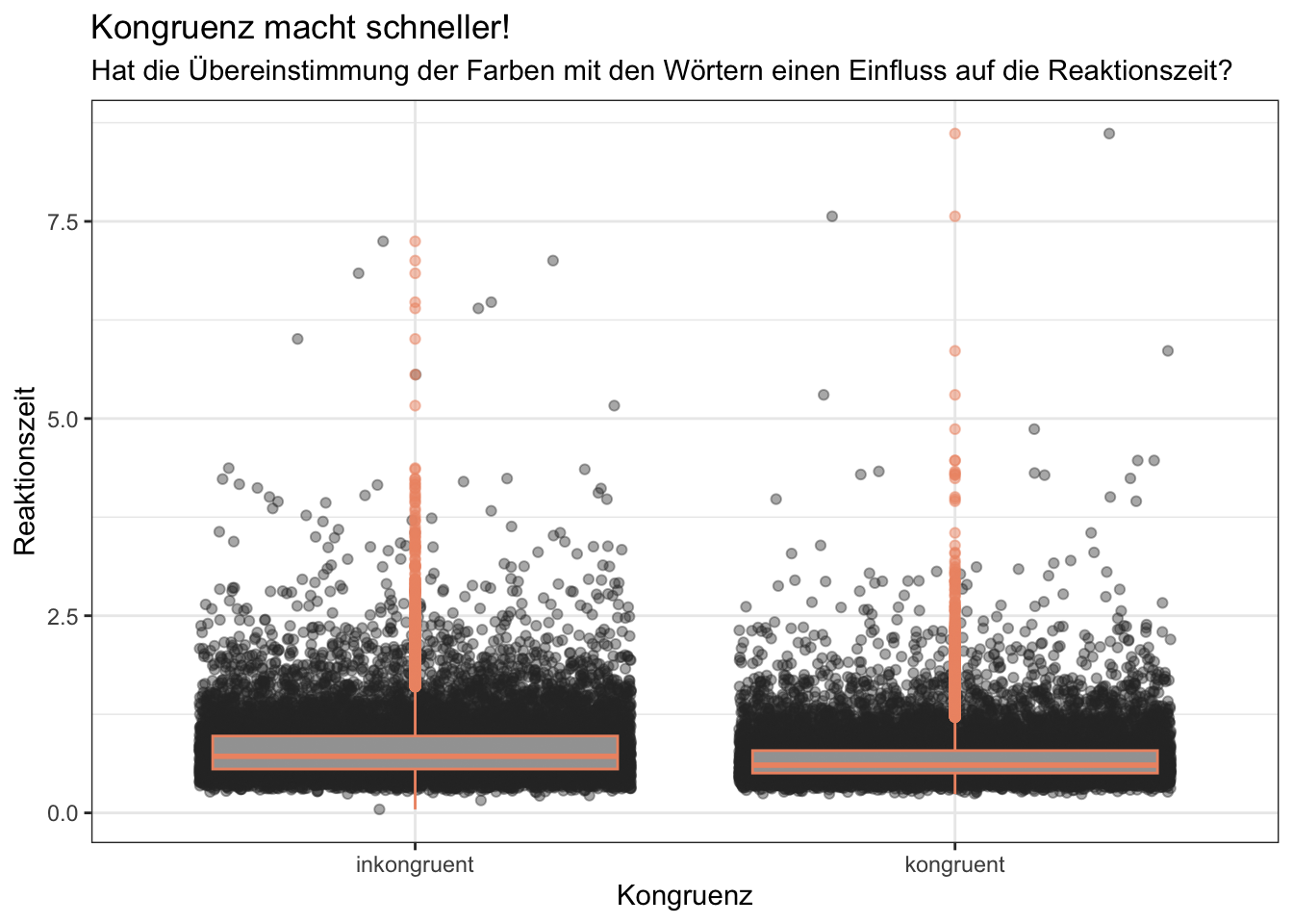
# Beginnen Sie hier mit Ihrem Code:

d$congruent <- as.factor(d$congruent)
levels(d$congruent) <- c("inkongruent", "kongruent")

p = d %>%
    ggplot(mapping = aes(congruent,
                         rt))+
    geom_jitter(alpha = 0.4, color = "grey18")+
    geom_boxplot(color = "lightsalmon2", alpha = 0.5)+
    labs(x = "Kongruenz",
         y = "Reaktionszeit",
         title = "Kongruenz macht schneller!",
         subtitle = "Hat die Übereinstimmung der Farben mit den Wörtern einen Einfluss auf die Reaktionszeit?")+
    theme_bw()

p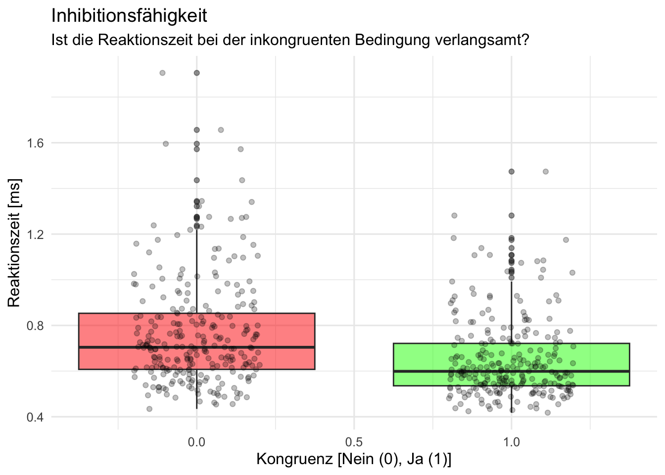
# Beginnen Sie hier mit Ihrem Code:
#alles zu faktoren machen
d <- d |>
    mutate(across(where(is.character), as.factor))

#daten anschauen
# d |>
#     slice_head(n = 10)

# Daten gruppieren:  Anzahl Trials, Accuracy und mittlere Reaktionszeit berechnen
d_acc_rt_individual <- d |>
    group_by(id, congruent) |>
    summarise(
        N = n(),
        ncorrect = sum(corr),
        accuracy = mean(corr),
        median_rt = median(rt)
    )


# Plot erstellen

p <- d_acc_rt_individual |>
    ggplot(aes(x = congruent, y = median_rt, fill = factor(congruent))) +
    geom_boxplot(alpha = .5) +
    geom_jitter(alpha = .25, width = .2) +
    scale_fill_manual(values = c("0" = "red", "1" = "green")) +
    labs(title = "Inhibitionsfähigkeit",
         subtitle = "Ist die Reaktionszeit bei der inkongruenten Bedingung verlangsamt?",
         x = "Kongruenz [Nein (0), Ja (1)]",
         y = "Reaktionszeit [ms]") +
    theme_minimal(base_size = 12) +
    theme(legend.position = "none")

#Plot ausgeben
p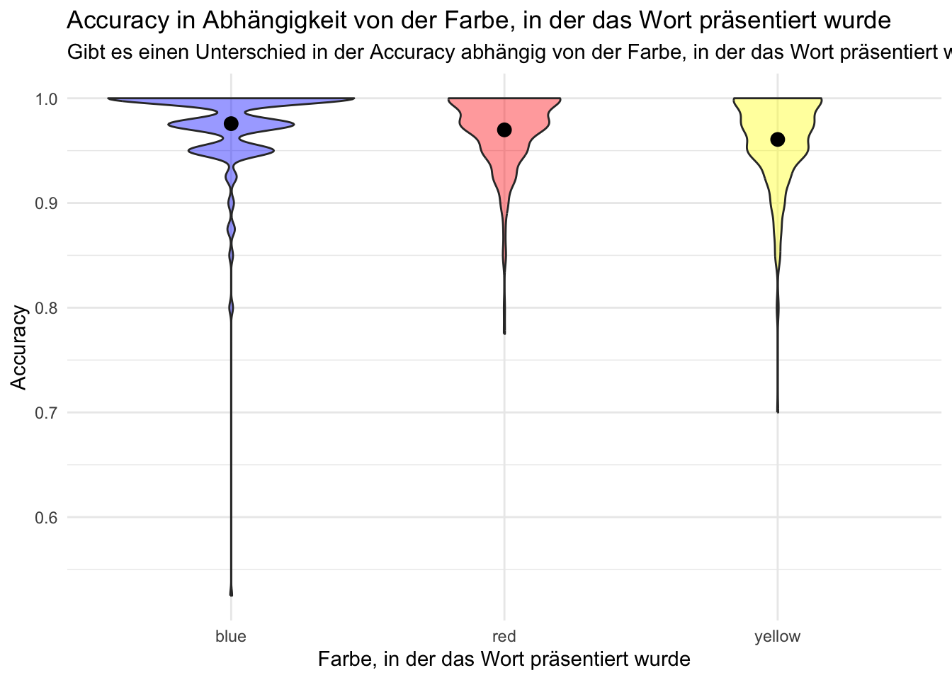
# Beginnen Sie hier mit Ihrem Code:

d_id_color <- d |>
    group_by(id, color) |>
    summarise(
        accuracy = mean(corr),
    )  |>
    filter(accuracy > 0.5)

d_color <- d |>
    group_by(color) |>
    summarise(
        accuracy = mean(corr),
    ) |>
    filter(accuracy > 0.5)

p = d |>
    ggplot(data = d_id_color,
           mapping = aes(x = color,
                         y = accuracy,
                         fill = color)) +
    geom_violin(show.legend = FALSE,
                alpha = .4) +
    scale_fill_manual(values = c(blue = "blue",
                                 yellow = "yellow",
                                 red = "red")) +
    theme_minimal() +
    geom_point(data = d_color,
               show.legend = FALSE,
               size = 3) +
    labs(title = "Accuracy in Abhängigkeit von der Farbe, in der das Wort präsentiert wurde",
         subtitle = "Gibt es einen Unterschied in der Accuracy abhängig von der Farbe, in der das Wort präsentiert wurde?",
         x = "Farbe, in der das Wort präsentiert wurde",
         y = "Accuracy")

p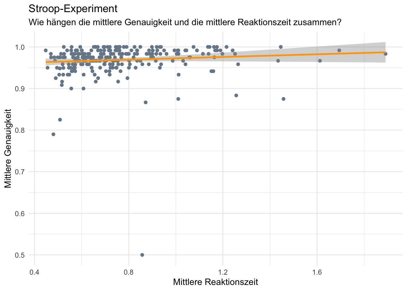
# Beginnen Sie hier mit Ihrem Code:
# glimpse(d)

#Daten filtern
d <- d |>
    filter(rt > 0.09 & rt < 15)

acc_rt_individual <- d |>
    group_by(id, congruent) |>
    summarise(
        N = n(),
        ncorrect = sum(corr),
        accuracy = mean(corr),
        median_rt = median(rt)
    )

n_exclusions <- acc_rt_individual |>
    filter(N < 40)

d <- d |>
    filter(!id%in% n_exclusions$id)

#Vorbereitung für Plot
reaction_time_zf <- d %>%
    group_by(congruent) %>%
    summarise(mean_reaction_time = mean(rt),
              sd_reaction_time = sd(rt),
              n = n())

accuracy_zf <- d %>%
    group_by(congruent) %>%
    summarise(accuracy = mean(corr))

id_zf <- d %>%
    group_by(id) %>%
    summarise(mean_reaction_time = mean(rt),
              mean_accuracy = mean(corr))

#Plot erstellen
p = ggplot(id_zf, aes(x = mean_reaction_time, y = mean_accuracy)) +
    geom_point(color="lightslategray") +
    geom_smooth(method=lm , color="orange", se=TRUE) +
    labs(title = "Stroop-Experiment",
         subtitle = "Wie hängen die mittlere Genauigkeit und die mittlere Reaktionszeit zusammen?",
         x = "Mittlere Reaktionszeit",
         y = "Mittlere Genauigkeit") +
    theme_minimal()

p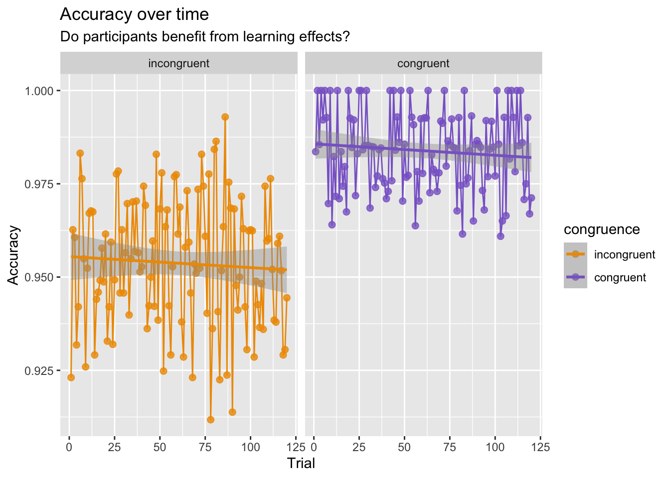
# Beginnen Sie hier mit Ihrem Code:

d <- mutate(d, congruence = as.factor(congruent),
                color = as.factor(color))

levels(d$congruence)[levels(d$congruence) == '0'] <- 'incongruent'
levels(d$congruence)[levels(d$congruence) == '1'] <- 'congruent'
# levels(d$congruence)

d_acc_con_trial <- d |>
    group_by(congruence, trial) |>
    summarise(accuracy = mean(corr))

d_acc_con_trial |>
    ggplot(aes(x = trial, y = accuracy, color = congruence)) +
    geom_point(size = 2, alpha = 0.8) +
    geom_line() +
    scale_color_manual(values = c(incongruent = "orange2",
                                  congruent = "mediumpurple3")) +
    facet_wrap(~ congruence) +
    labs(x = "Trial",
         y = "Accuracy",
         title = "Accuracy over time",
         subtitle = "Do participants benefit from learning effects?")+
    geom_smooth(method = lm) +
    theme_gray(base_size = 11)

# d_acc_con_trial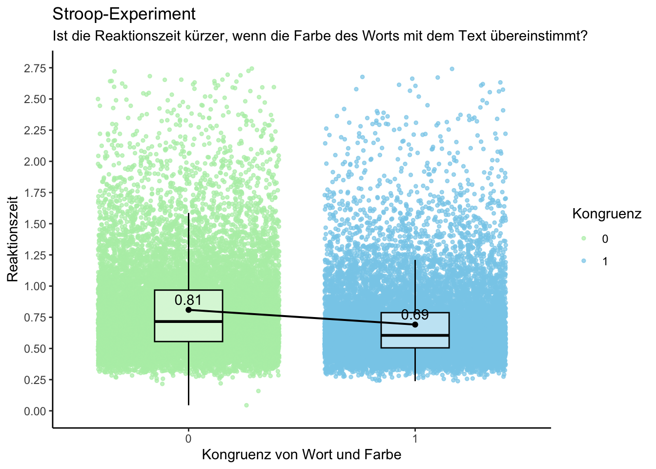
#Fragestellung: Ist die Person schneller, wenn Farbe und Wort kongruent sind? d.h. Variablen congruent und rt relevant

# glimpse(d)
#Wie viele unterschiedliche Variablen gibt es? -> 8
#Wie heissen die Variablen? -> id, trial, word, color, congruent, resp, corr, rt
#Welches Skalenniveau haben sie? -> congruent, corr, word, color = Nominalskaliert; rt = Verhältnisskalsiert


#Variable congruent als Faktor definieren
d <- d %>% mutate(congruent = as.factor(congruent))


# Code des Plots:
## Plot soll Verteilung der Reaktionszeiten sowie die mittlere Reaktionszeit
## bei den beiden Bedingungen Kongruent = 1 und Kongruent = 0 zeigen

p = d %>%
    ggplot(mapping =
               aes(x = congruent,
                   y = rt,
                   color = congruent,
                   fill = congruent)) +
    geom_jitter(size = 1,
                alpha = 0.7) +
    geom_boxplot(width = 0.3,
                 fill = "white",
                 color ="black",
                 outlier.color = "black",
                 outlier.shape = NA,
                 alpha = 0.5) +
    scale_color_manual(values = c("#B4EEB4", "#87CEEB"), name = "Kongruenz",
                       (labels = c("nicht kongruent", "kongruent"))) +
    scale_fill_manual(values = c("#B4EEB4", "#87CEEB")) +
    stat_summary(fun = mean,
                 geom = "point",
                 shape = 19,
                 size = 1.5,
                 color = "black",
                 fill = "black",
                 position=position_dodge(width=0.5)) +  # Punkt für Mittelwert
    stat_summary(fun.data = mean_sdl,
                 geom = "errorbar",
                 width = 0.2,
                 color = "black",
                 fill = "black",
                 position = position_dodge(width = 0.5)) +  # Standardabweichung
    stat_summary(fun = mean,
                 geom = "line",
                 aes(group = 1),
                 linetype = "solid",
                 size = 0.7,
                 color = "black",
                 position = position_dodge(width = 0.8)) +  # Linie für Mittelwert-Differenz
    geom_text(aes(label = round(..y.., 2)),
              stat = "summary",
              vjust = -0.5,
              color = "black",
              fill = "black",
              position = position_dodge(width = 0.5)) +  # Mittelwert-Beschriftung
    labs(title = "Stroop-Experiment",
         subtitle = "Ist die Reaktionszeit kürzer, wenn die Farbe des Worts mit dem Text übereinstimmt?",
         x = "Kongruenz von Wort und Farbe",
         y = "Reaktionszeit") +
    scale_y_continuous(limits = c(0, 2.75), breaks = seq(0, 3, by = 0.25)) +  # Definiert die Achsenskalierung für die y-Achse
    theme_classic() +
    guides(fill = FALSE)
p

#ggsave(filename = "thomann_laura_plot.png",
# plot = p)[1] "incongruent" "congruent" 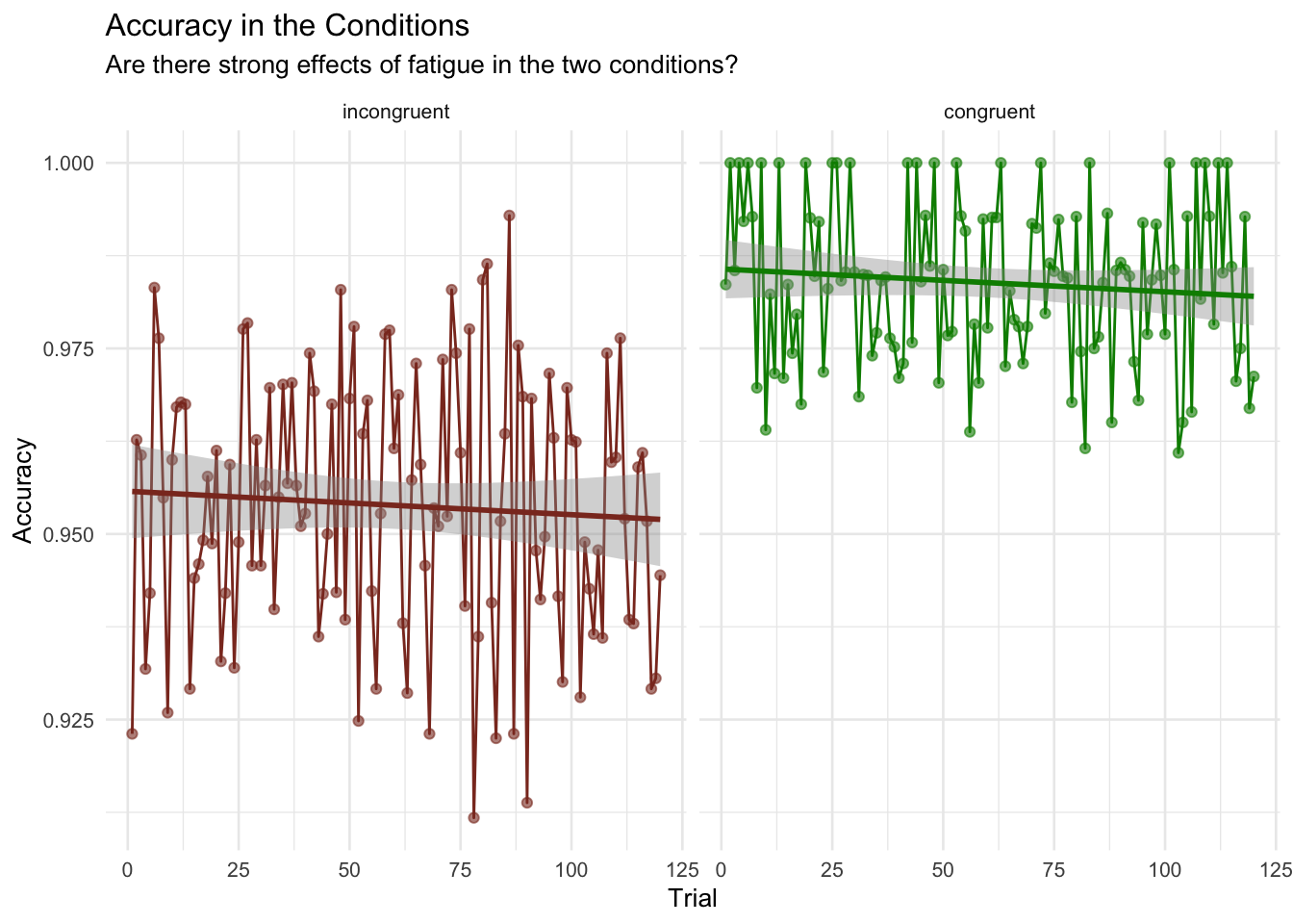
# Beginnen Sie hier mit Ihrem Code:
# Datenbereinigung und Faktorenbenennung: Reaktionszeiten unter 100ms und über 10s
# werden ausgeschlossen, Reduktion von 31800 zu 31780 observations
d <- mutate(d, color = as.factor(color),
condition = as.factor(congruent))%>%
filter(rt > 0.09 & rt < 10.01)
# Umbennenung der Faktoren von "Condition"
levels(d$condition)[levels(d$condition) == '0'] <- 'incongruent'
levels(d$condition)[levels(d$condition) == '1'] <- 'congruent'
levels(d$condition)
# Suche nach fehlenden Werten (NA), keine gefunden, daher muss nichts ausgeschlossen werden
d_missings <- d %>% naniar::add_label_missings() %>%
filter(any_missing == "Missing")
# head(d_missings)
#Vorbereitung der Daten mit Accuracy als Mittelwert der Korrekten Antworten und Median_rt als Median der Reaktionszeit
d_acc_rt_trial <- d %>%
group_by(condition, trial) %>%
summarise(
accuracy = mean(corr),
median_rt = median(rt)
)
#Darstellung der Ermüdungseffekte mit einem Line-Plot
ermüdungseffekte <- d_acc_rt_trial %>%
ggplot(aes(x = trial, y = accuracy, color = condition)) +
geom_point(size = 1.5, alpha = 0.6) +
geom_line() +
scale_color_manual(values = c(incongruent = "tomato4",
congruent = "green4")) +
facet_wrap(~ condition) +
labs(x = "Trial",
y = "Accuracy",
title = "Accuracy in the Conditions",
subtitle = "Are there strong effects of fatigue in the two conditions?") +
geom_smooth(method = lm) +
theme_minimal(base_size =10) +
theme(legend.position = "none")
ermüdungseffekte
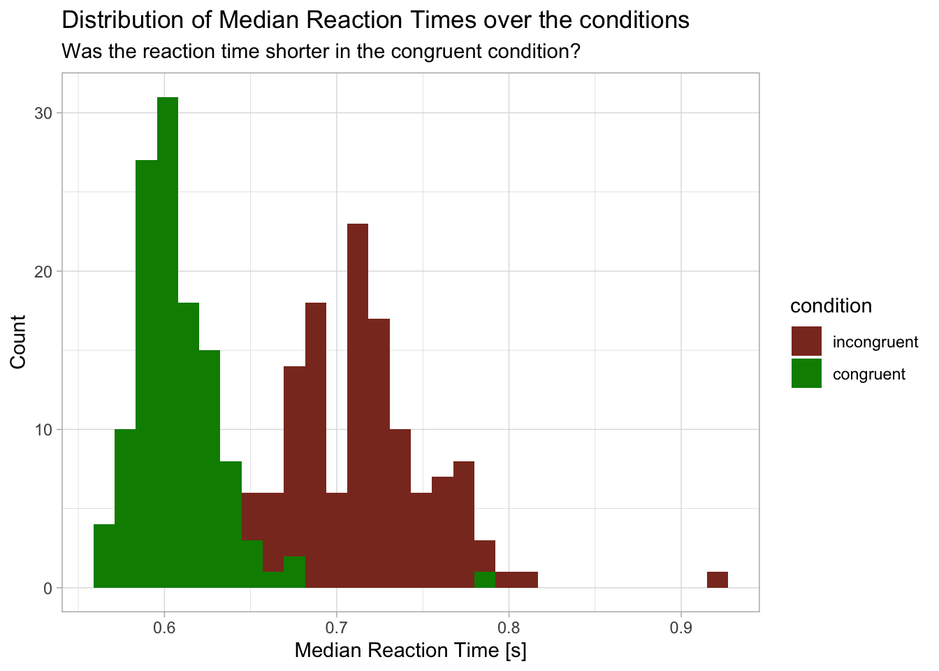
#Darstellung der Verteilung der Median Reaction Times
histo_rt_and_accuracy <- d_acc_rt_trial %>%
ggplot(aes(x = median_rt, fill = condition)) +
geom_histogram()+
scale_fill_manual(values = c(incongruent = "tomato4",
congruent = "green4")) +
labs(x = "Median Reaction Time [s]",
y = "Count",
title = "Distribution of Median Reaction Times over the conditions",
subtitle = "Was the reaction time shorter in the congruent condition?") +
theme_light()
histo_rt_and_accuracy
#Darstellung der Reaktionszeiten von 3 Teilnehmern über die Konditionen hinweg mit line plot und Trendlinie
rt_of_three_participants <- d %>%
filter(id %in% c("sub-10318869", "sub-1106725", "sub-113945")) %>%
ggplot(aes(x = trial, y = rt, color = condition)) +
geom_smooth(method = "lm", se = FALSE) +
geom_point(alpha = 0.5) +
scale_color_manual(values = c(incongruent = "tomato3",
congruent = "green4")) +
facet_wrap(~ id) +
labs(x = "Trial",
y = "Reaction Time [s]",
title = "Reaction time of 3 participants",
subtitle = "Was the reaction time shorter in the congruent condition for specific participants?") +
theme_light()
# rt_of_three_participants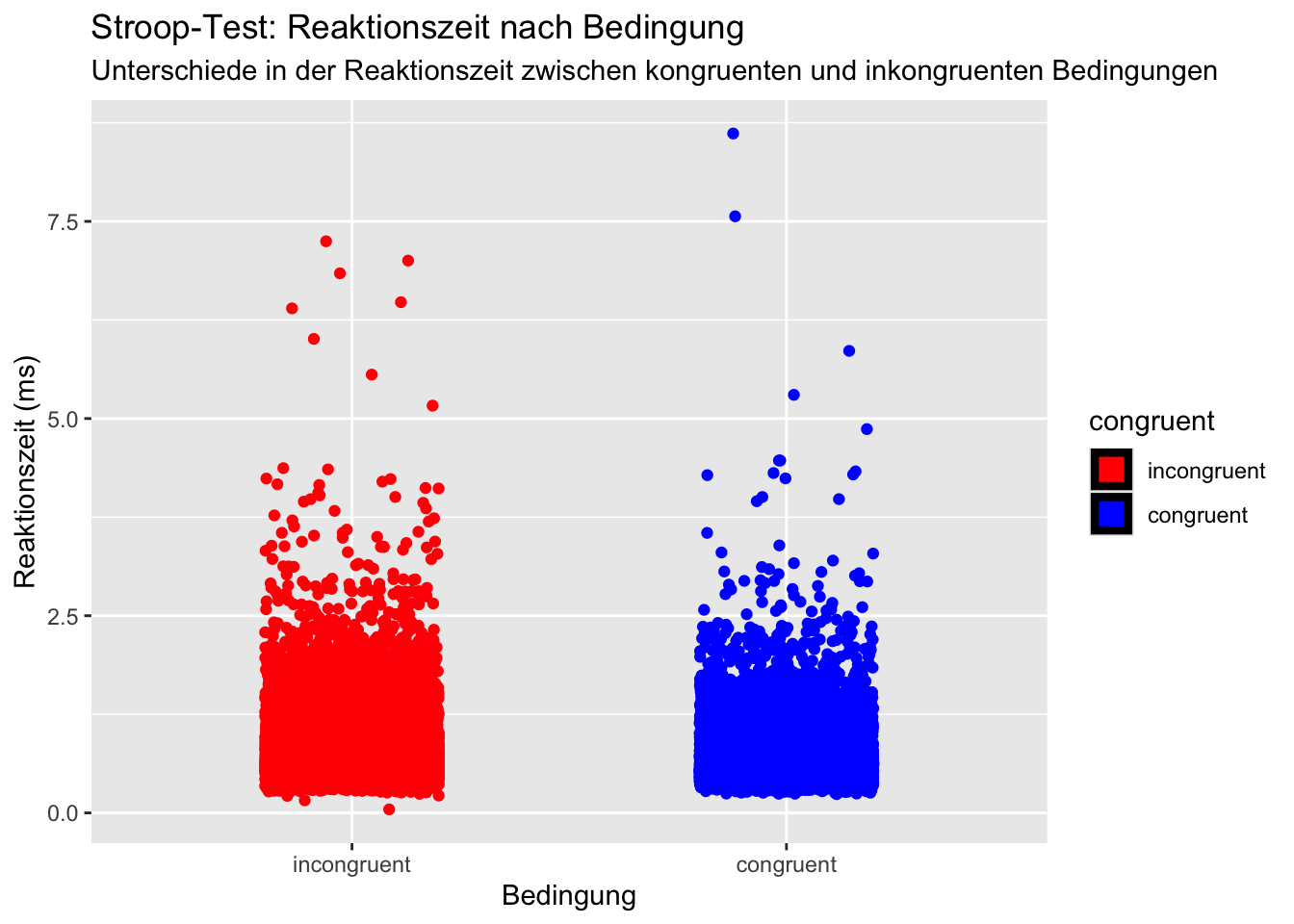
# Beginnen Sie hier mit Ihrem Code:

# Filtern der relevanten Variablen
benötigte_daten <- d[, c("congruent", "rt")]

# Anzeigen der ersten Zeilen des gefilterten Datensatzes
# head(benötigte_daten)

# Umwandlung der Variable 'congruent' in einen Faktor
benötigte_daten$congruent <- factor(benötigte_daten$congruent, levels = c(0, 1), labels = c("incongruent", "congruent"))

# Erstellung des Plots
plot<- ggplot(benötigte_daten, aes(x = congruent, y = rt, fill = congruent, color = congruent)) +
  # Hinzufügen der Balken für die Mittelwerte und Standardabweichungen
  stat_summary(fun.data = "mean_cl_normal", geom = "bar", size = 1.5, color = "black") +
  # Hinzufügen der rohen Daten als Punkte
  geom_jitter(width = 0.2) +
  # Hinzufügen von Linien für die Standardabweichungen
  stat_summary(fun.data = mean_sdl, geom = "errorbar", width = 0.2, size = 1, color = "black") +
  # Farben
  scale_fill_manual(values = c("congruent" = "blue", "incongruent" = "red")) +
  scale_color_manual(values = c("congruent" = "blue", "incongruent" = "red")) +
  # Beschriftungen
  labs(title = "Stroop-Test: Reaktionszeit nach Bedingung",
       subtitle = "Unterschiede in der Reaktionszeit zwischen kongruenten und inkongruenten Bedingungen",
       x = "Bedingung", y = "Reaktionszeit (ms)") +
  # Design
  theme_get()

#anzeigen lassen
print(plot)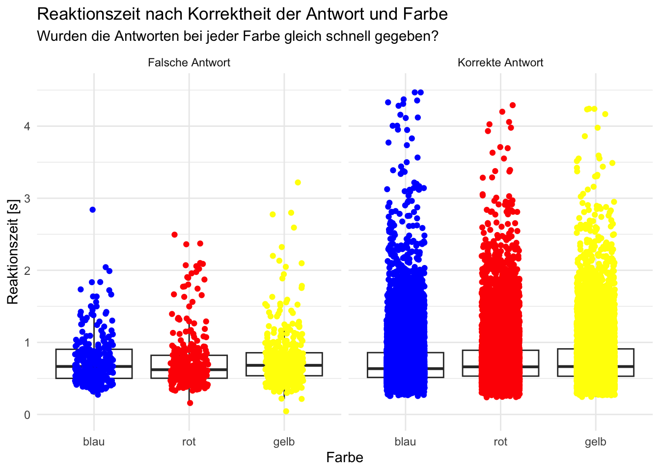
# Code innerhalb der folgenden 2 Linien darf nicht verändert werden
# --------------------------------------------------------------------------------------
# Beginnen Sie hier mit Ihrem Code:

# glimpse(d)

# Daten nach Farbe gruppieren
d <- d %>%
  group_by(color)

# Daten plotten
ggplot(d, aes(x = color, y = rt)) +
  geom_boxplot(width = 0.8, outlier.shape = NA) +
  labs(title = "Reaktionszeit nach Korrektheit der Antwort und Farbe", subtitle = "Wurden die Antworten bei jeder Farbe gleich schnell gegeben?", x = "Farbe", y = "Reaktionszeit [s]") +
  geom_jitter(aes(color = color), width = 0.2) +
  coord_cartesian(ylim = c(0, 4.51)) + # rt > 4.51 werden nicht in die Auswertung miteinbezogen
  scale_x_discrete(labels = c("blue" = "blau", "red" = "rot", "yellow" = "gelb")) +
  scale_color_manual(values = c("blue" = "blue", "red" = "red", "yellow" = "yellow")) +
  guides(color = FALSE) +
  theme_minimal()  +
  facet_wrap(~ corr, labeller = labeller(corr = c("0" = "Falsche Antwort", "1" = "Korrekte Antwort")))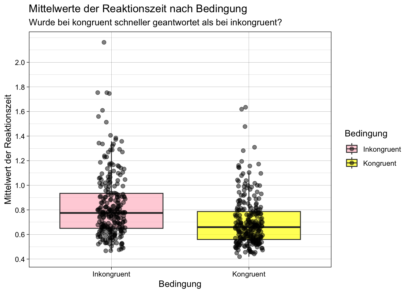
grouped_and_summarized_data<- d |>
    group_by(id,congruent) |>
    summarise(mean_rt= mean(rt))

data_kongruent <- filter(grouped_and_summarized_data, congruent == 0)
data_inkongruent <- filter(grouped_and_summarized_data, congruent == 1)

p = ggplot(data = grouped_and_summarized_data,
       aes(x = factor(congruent),
           y = mean_rt,
           fill = factor(congruent))) +
    geom_boxplot(alpha = 0.7, outlier.shape = NA) +
    geom_point(position = position_jitter(width = 0.1), size = 2, alpha = 0.5) +
    labs(x = "Bedingung", y = "Mittelwert der Reaktionszeit", fill = "Bedingung") +
    ggtitle("Mittelwerte der Reaktionszeit nach Bedingung") +
    scale_fill_manual(name = "Bedingung", values = c("0" = "pink", "1" = "yellow"),
                      labels = c("0" = "Inkongruent", "1" = "Kongruent")) +
    theme_linedraw() +
    scale_x_discrete(name = "Bedingung", labels = c("0" = "Inkongruent", "1" = "Kongruent")) +
    scale_y_continuous(breaks = seq(0, 2, by = 0.2)) +
    labs(x = "Bedingung", y = "Mittelwert der Reaktionszeit", fill = "Bedingung",
     subtitle = "Wurde bei kongruent schneller geantwortet als bei inkongruent?")

p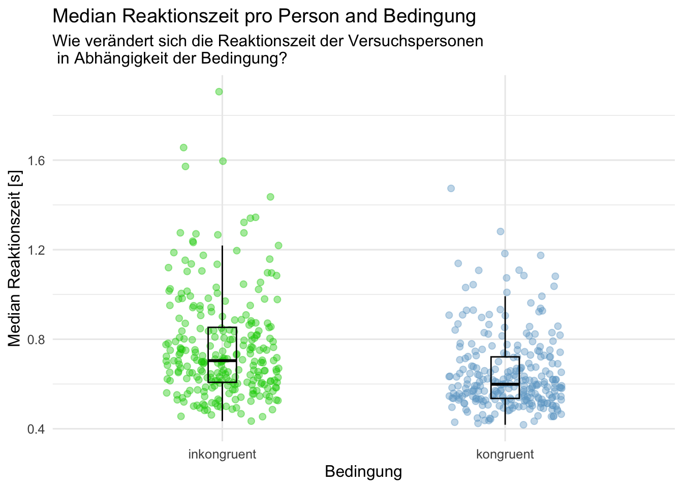
# Package laden

library(tidyverse)
# install.packages("patchwork")
library(patchwork)

# Daten einlesen und Textvariablen zu Faktoren umwandeln
# d |> #<- read.csv("data/dataset_stroop_clean.csv") |>
  # mutate(across(where(is.character), as.factor))

#Median von den Reaktionszeiten erstellen/berechnen
acc_rt_individual <- d |>
  group_by(id, congruent) |>
  summarise(
    N = n(),
    ncorrect = sum(corr),
    accuracy = mean(corr),
    median_rt = median(rt)
  )

# Datensatz anschauen
# acc_rt_individual |>
  # slice_head(n = 10)

#Aufgabenschwierigkeit und Performanz der Versuchspersonen

# Beginnen Sie hier mit Ihrem Code:
p1 <- acc_rt_individual |>
  na.omit()|>
  ggplot(aes(x = factor(congruent, levels = c(0,1)), y = median_rt, color = factor(congruent))) +
    geom_jitter(size = 2, alpha = 0.4,
                width = 0.2, height = 0) +
    geom_boxplot(width = 0.1, alpha = 0, color = "black") +
    scale_x_discrete(labels =c("0" = "inkongruent", "1" = "kongruent"))+
    scale_color_manual(values = c("0" = "green3",
                                "1" = "skyblue3"))+
    labs(x ="Bedingung",
         y = "Median Reaktionszeit [s]",
         title = "Median Reaktionszeit pro Person and Bedingung",
         subtitle = "Wie verändert sich die Reaktionszeit der Versuchspersonen \n in Abhängigkeit der Bedingung?")+
    theme_minimal(base_size = 12) +
    theme(legend.position = "none")


library(patchwork)

p1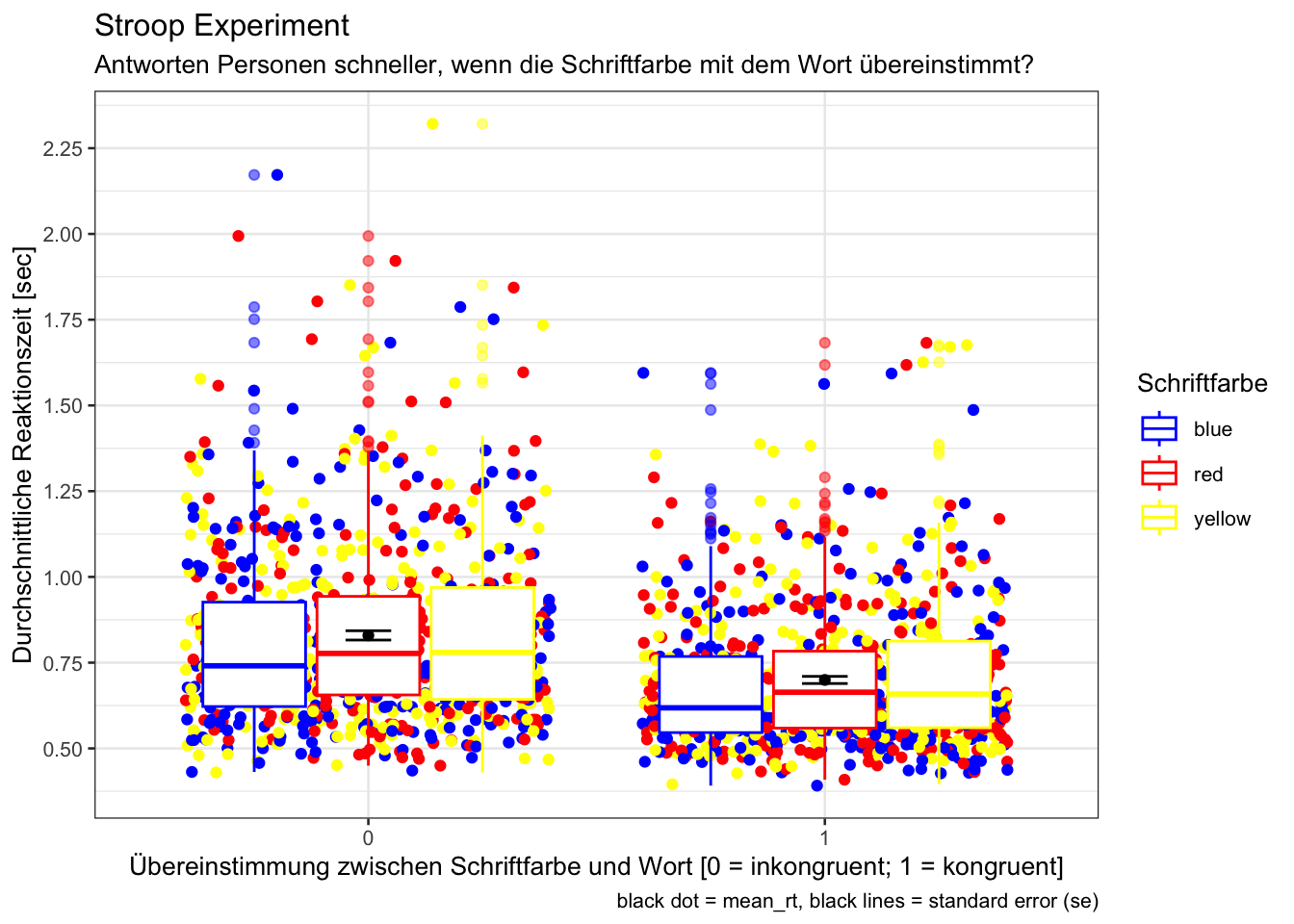
# Beginnen Sie hier mit Ihrem Code:

my_palette <- c("blue", "red", "yellow")

d_rt_within <- d |>
    mutate(congruent = as.factor(congruent)) |>
    group_by(id, congruent, color) |>
    summarise(mean_rt = mean(rt))


p = d_rt_within |>
    Rmisc::summarySEwithin(measurevar = "mean_rt",
                           withinvars = "congruent",
                           na.rm = TRUE,
                           conf.interval = 0.95)|>
    ggplot(mapping = aes(
        x = congruent,
        y = mean_rt)) +
    geom_jitter(data = d_rt_within,
                aes(colour = factor(color)))+
    geom_boxplot(data = d_rt_within,
                 aes(colour = factor(color)),
                 outlier.alpha = 0.5) +
    geom_errorbar(width = .1, aes(ymin = mean_rt-se, ymax = mean_rt+se)) +
    geom_point() +
    scale_color_manual(values = my_palette) +
    theme_bw(base_size = 10) +
    ggtitle("Stroop Experiment") +
    xlab("Übereinstimmung zwischen Schriftfarbe und Wort [0 = inkongruent; 1 = kongruent]") +
    ylab("Durchschnittliche Reaktionszeit [sec]") +
    labs(subtitle = "Antworten Personen schneller, wenn die Schriftfarbe mit dem Wort übereinstimmt?",
         colour = "Schriftfarbe",
         caption = "black dot = mean_rt, black lines = standard error (se)")

p + scale_y_continuous(breaks = seq(0.5, 2.3, by = 0.25))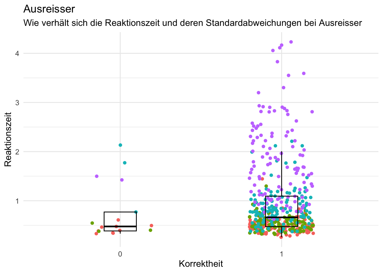
## Wie verhält sich die Reaktionszeit und deren Standardabweichungen bei Ausreisser

d <- d |>
    filter(rt > 0.1 & rt<5)

d_corr_individual <- d |>
    group_by(id, corr) |>
    summarise(
        rt = rt,
        median_rt = median(rt),
        sd_rt = sd(rt)) %>%
        mutate(corr= as.factor(corr))


p<- d_corr_individual %>%
  filter(id %in% c("sub-13366559", "sub-19843991", "sub-66321563", "sub-21474524")) %>%
  ggplot(aes(x = corr, y = rt, color = id)) +
  geom_jitter(alpha = 1, width = 0.2) +
  geom_boxplot(alpha = 0, width = 0.2, color = "black") +
  scale_fill_manual(values = c("sub-13366559" = "tomato3",
                               "sub-19843991" = "skyblue3",
                               "sub-66321563" = "pink" ,
                               "sub-21474524" = "green")) +
  labs(title = "Ausreisser",
       subtitle = "Wie verhält sich die Reaktionszeit und deren Standardabweichungen bei Ausreisser",
       x = "Korrektheit",
       y = "Reaktionszeit") +
  theme_minimal(base_size = 12) +
  theme(legend.position = "none")
p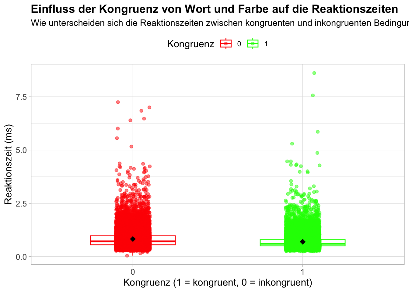
# Beginnen Sie hier mit Ihrem Code:


p = d |>
    ggplot(aes(x = as.factor(congruent), y = rt, color = as.factor(congruent))) +
    geom_boxplot(alpha = 0.5, outlier.shape = NA, width = 0.5) +
    geom_jitter(width = 0.1, alpha = 0.5) +  # Überlappung der Punkte reduzieren
    stat_summary(
        fun.data = mean_se, geom = "errorbar", width = 0.2,
        aes(group = congruent)
    ) +  # Fehlerbalken für den Mittelwert +/- Standardfehler
    stat_summary(
        fun = mean, geom = "point", size = 3, shape = 18,
        aes(group = congruent), color = "black"
    ) +  # Mittelwerte als Punkte
    labs(
        title = "Einfluss der Kongruenz von Wort und Farbe auf die Reaktionszeiten",
        subtitle = "Wie unterscheiden sich die Reaktionszeiten zwischen kongruenten und inkongruenten Bedingungen?",
        x = "Kongruenz (1 = kongruent, 0 = inkongruent)",
        y = "Reaktionszeit (ms)",
        color = "Kongruenz"  # Legendenbeschriftung auf Deutsch
    ) +
    scale_color_manual(values = c("1" = "green", "0" = "red")) +  # Farben anpassen
    theme_light() +
    theme(
        legend.title = element_text(size = 12),  # Grösse der Legendenüberschrift anpassen
        legend.position = "top",  # Legende oben platzieren
        plot.title = element_text(size = 14, face = "bold"),  # Titel grösser und fett
        axis.title = element_text(size = 12),  # Achsentitelgröße anpassen
        axis.text = element_text(size = 10)  # Achsenbeschriftungsgröße anpassen
    )


print(p)[1] "incongruence" "congruence" 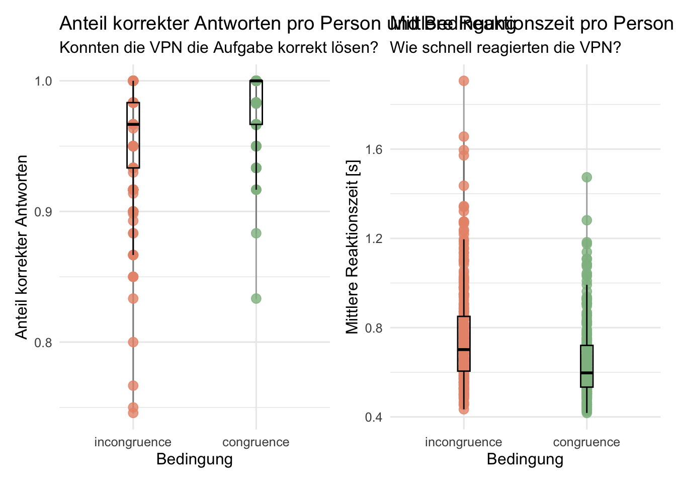
# Beginnen Sie hier mit Ihrem Code:
#Zu Factors machen
d <- mutate(d, color = as.factor(color),
            condition = as.factor(congruent))

#Diagnostik: Daten untersuchen
#zu schnelle und zu langsame Antworten ausschliessen
d <- d |>
    filter(rt > 0.09 & rt < 15)

#Person mit correct 1 ausschliessen
d <- d |>
    filter(id != "sub-80444009")

#Benennung ändern
levels (d$condition) [levels (d$condition) == '0'] <- 'incongruence'
levels (d$condition) [levels (d$condition) == '1'] <- 'congruence'
levels (d$condition)

#Daten gruppieren:  Anzahl Trials, Accuracy und mittlere Reaktionszeit berechnen
acc_rt_individual <- d |>
    group_by(id, condition) |>
    summarise(
        N = n(),
        ncorrect = sum(corr),
        accuracy = mean(corr),
        median_rt = median(rt)
    )

#Plot darstellen
plot1 <- acc_rt_individual %>%
    ggplot(aes(x = condition, y = accuracy, color = condition)) +
    geom_line(color = "grey40", alpha = 0.5) +
    geom_jitter(size = 3, alpha = 0.8,
                width = 0, height = 0) +
    geom_boxplot(width = 0.1, alpha = 0, color = "black") +
    scale_color_manual(values = c(incongruence = "#E9967A",
                                  congruence = "#8FBC8F")) +
    labs(x = "Bedingung",
         y = "Anteil korrekter Antworten",
         title = "Anteil korrekter Antworten pro Person und Bedingung",
         subtitle = "Konnten die VPN die Aufgabe korrekt lösen?") +
    theme_minimal(base_size = 12) +
    theme(legend.position = "none")

plot2 <- acc_rt_individual %>%
    ggplot(aes(x = condition, y = median_rt, color = condition)) +
    geom_line(color = "grey40", alpha = 0.5) +
    geom_jitter(size = 3, alpha = 0.8,
                width = 0, height = 0) +
    geom_boxplot(width = 0.1, alpha = 0, color = "black") +
    scale_color_manual(values = c(incongruence = "#E9967A",
                                  congruence = "#8FBC8F")) +
    labs(x = "Bedingung",
         y = "Mittlere Reaktionszeit [s]",
         title = "Mittlere Reaktionszeit pro Person und Bedingung",
         subtitle = "Wie schnell reagierten die VPN?") +
    theme_minimal(base_size = 12) +
    theme(legend.position = "none")

# install.packages("patchwork")
library(patchwork)

plot1 + plot2
Reuse
Citation
BibTeX citation:
@online{fitze,
  author = {Fitze, Daniel and Wyssen, Gerda},
  title = {Plot {Gallery} - {Mo}},
  url = {https://kogpsy.github.io/neuroscicomplabFS24//pages/chapters/gallery_mo.html},
  langid = {en}
}
For attribution, please cite this work as:
Fitze, Daniel, and Gerda Wyssen. n.d. “Plot Gallery - Mo.”
https://kogpsy.github.io/neuroscicomplabFS24//pages/chapters/gallery_mo.html.